Case study
A two-sided marketplace, end to end
Sellers and buyers in one product, with opposite goals. Every decision that made one side happier risked making the other side leave.
HuertApp is a mobile marketplace connecting small local farmers directly with buyers who want fresh produce without intermediaries. I built the whole case myself, from first interview to final interface. It is here for a reason: client work can only be shown in part, so this is where you can see how I actually think — including the parts that did not work and the things I never got to validate.
The idea is personal. I grew up in a farming family, and I have watched small producers accept whatever price the middleman offers. That is the problem the product tries to move.
I used design thinking as the backbone of the project, but not as a straight line. Two rounds of usability testing sent me back to the listing and the farmer profile, and the interface only came once the structure had survived those tests.
01 · Research
Two sides, opposite goals
A marketplace only works when both sides show up. So the research had to cover both, and they wanted different things.
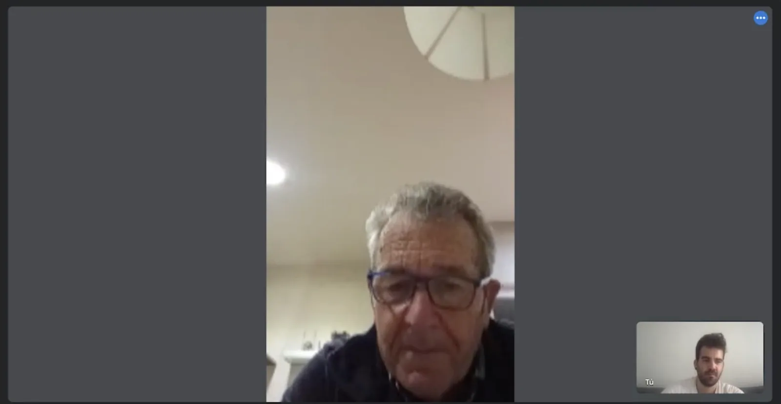
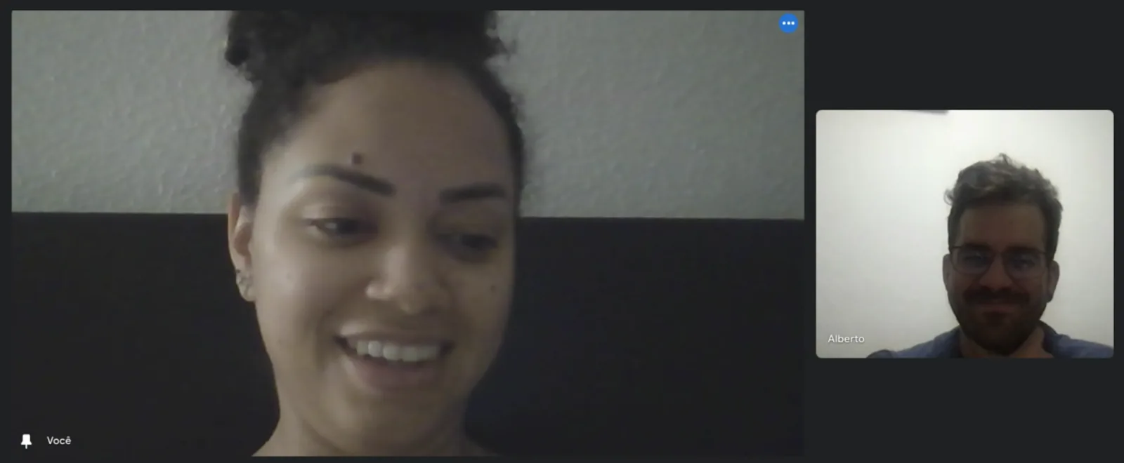
Interviews with farmers and with buyers of local produce surfaced four problems that kept repeating. Farmers have almost no way to sell directly and depend on intermediaries, which keeps their margins low. They have little digital presence, and many cannot handle transport and delivery themselves, which limits how far they can sell. On the other side, buyers do not know where to find local producers near them, and they do not trust what they cannot trace.
Those four points became the brief. Anything the product did had to answer at least one of them, for one of the two sides, without breaking the other.
Interviews
Personas
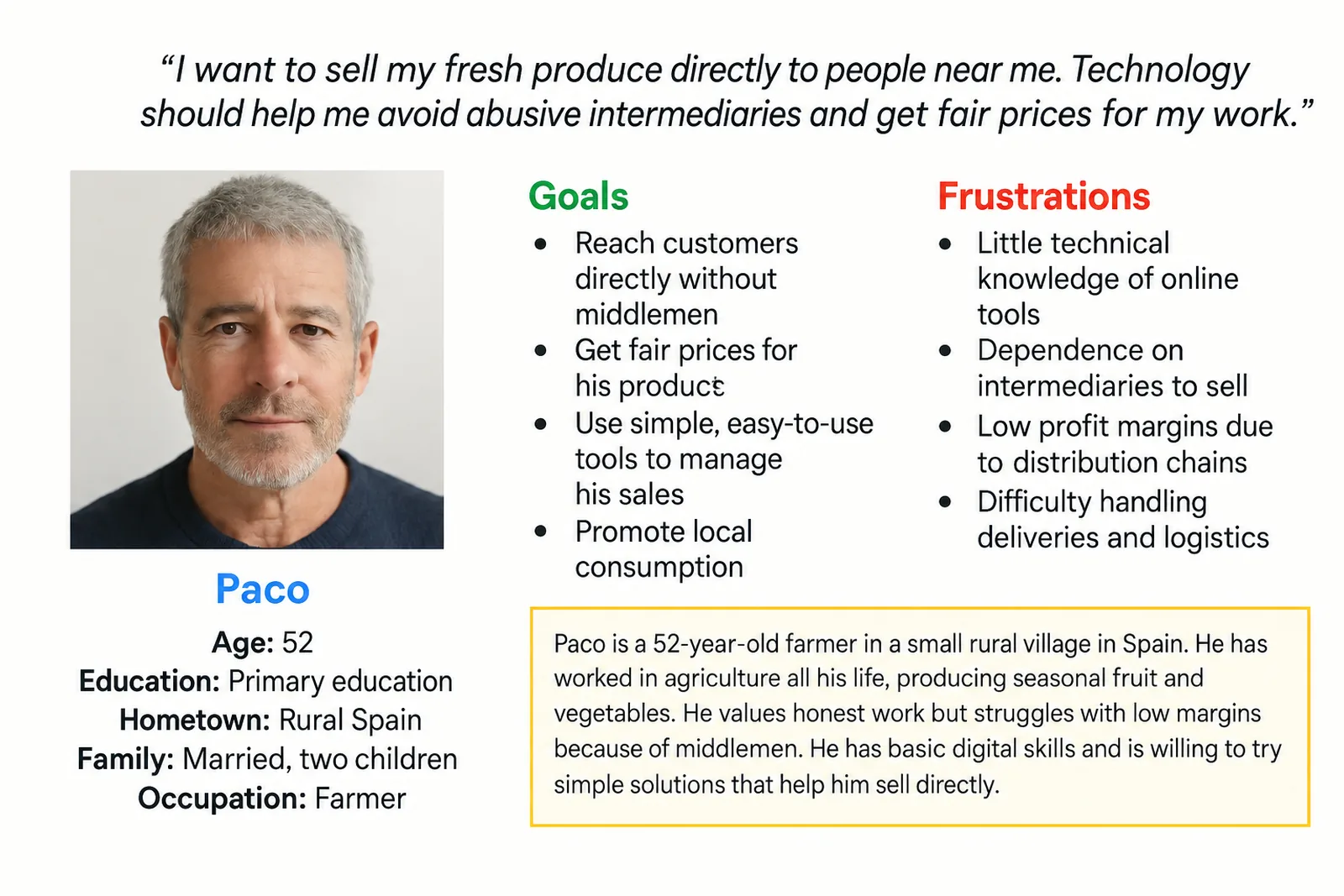
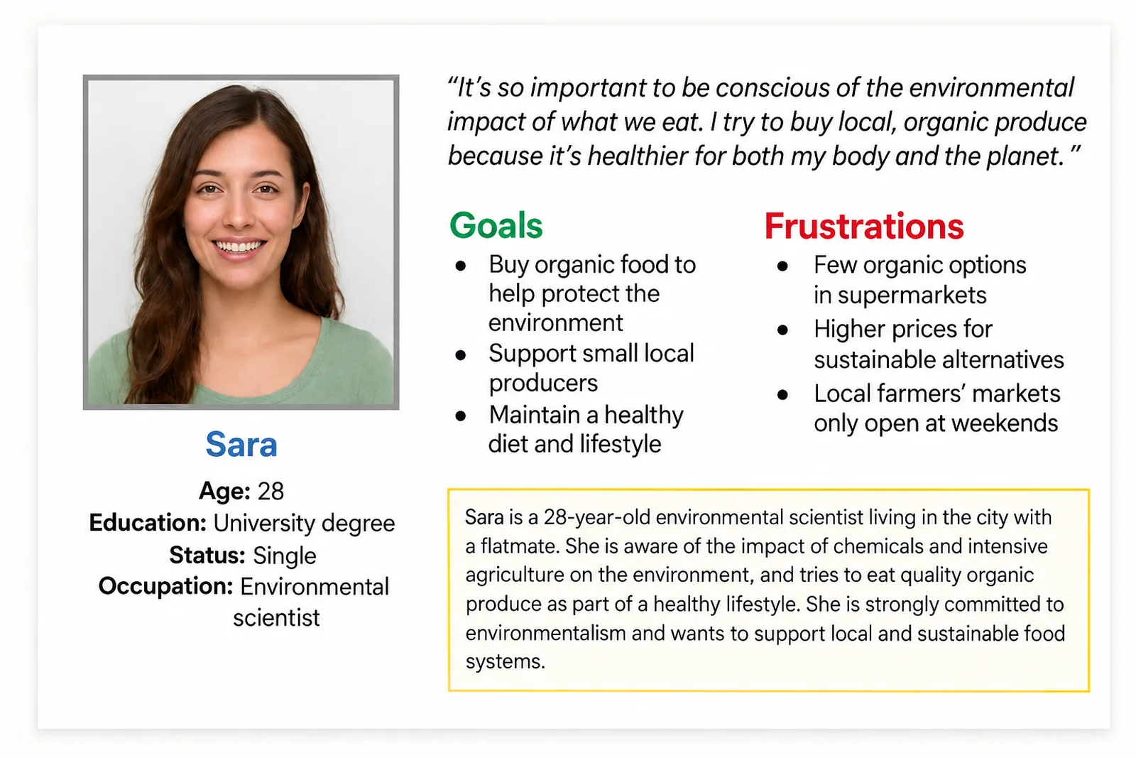
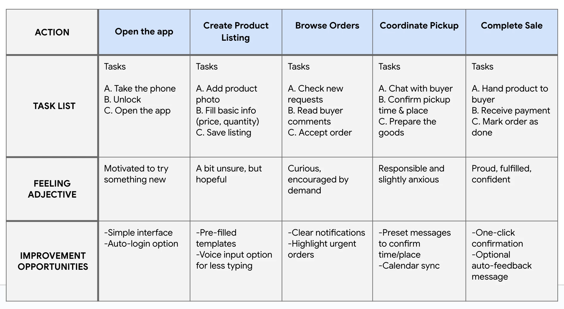
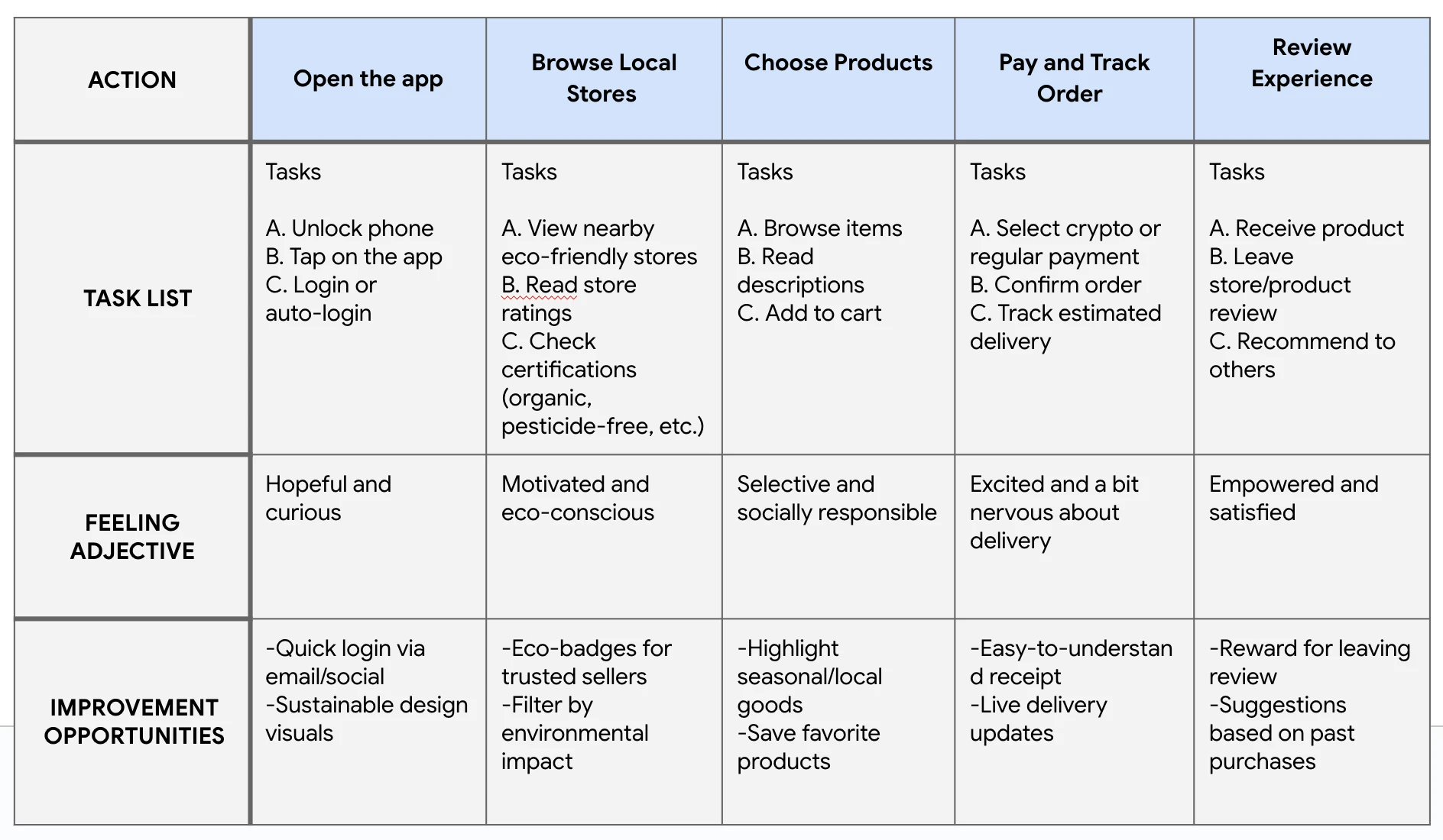
Paco needs to reach buyers without technical barriers. Sara needs to find producers nearby and trust what she is buying. The same screen has to serve both, which is the central tension of the whole project.
User journey maps
02 · The problem
Framing the problem
Before designing screens, I needed to know what happens around them.


The storyboards were the cheapest way to test whether the idea held together as an experience rather than as a set of features. The big picture one covers the whole journey; the close-up zooms into the moment that matters most, when a buyer decides to contact a producer.
03 · Ideas
Paper first, on purpose
Cheap sketches make it easier to throw ideas away.

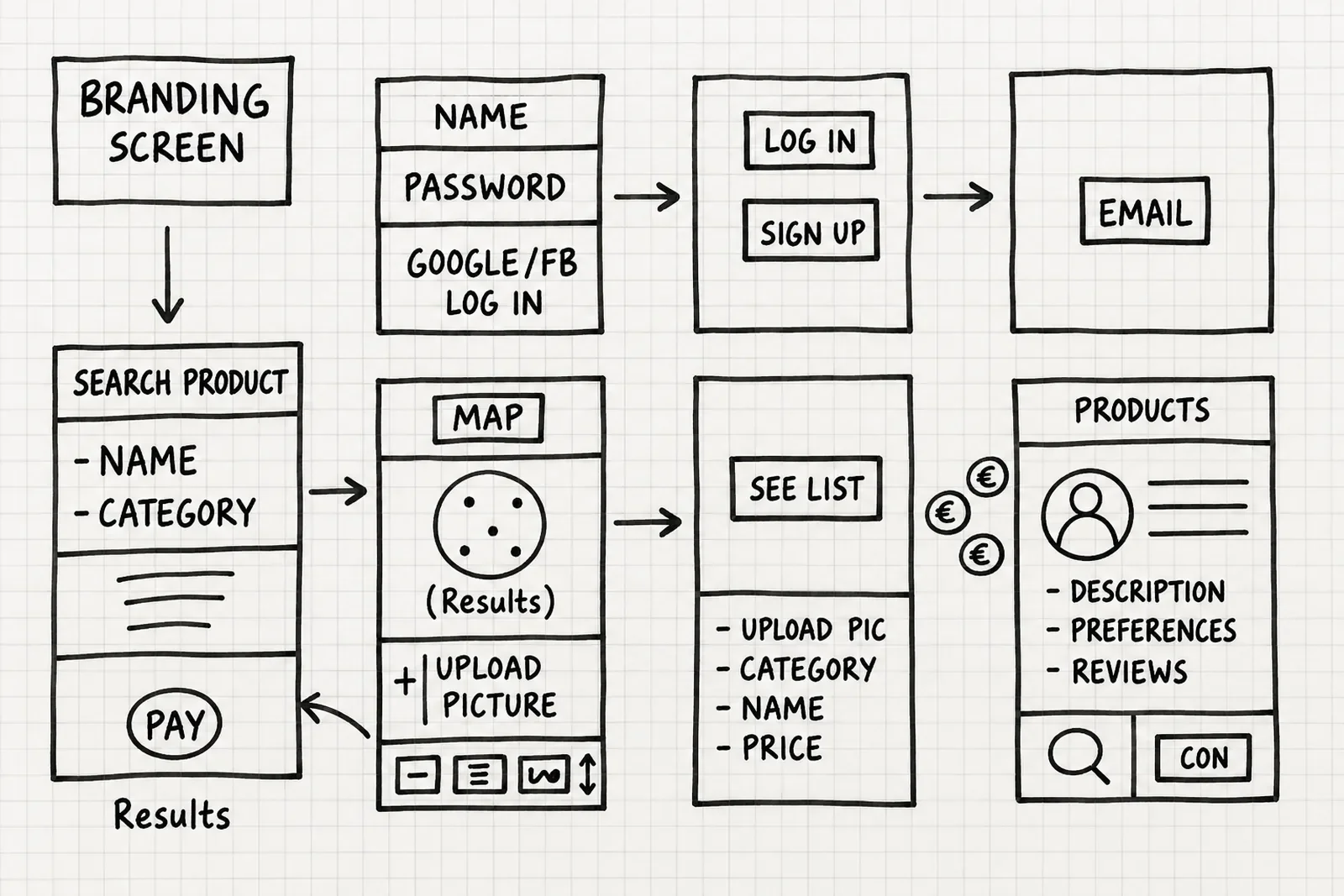
I sketched multiple versions of each key screen before choosing anything. Working on paper keeps the cost of discarding an idea at zero, which is exactly when you are most willing to discard it.

The sitemap settled the structure: what each side can do, where those paths cross, and where they must stay apart.
04 · Prototype
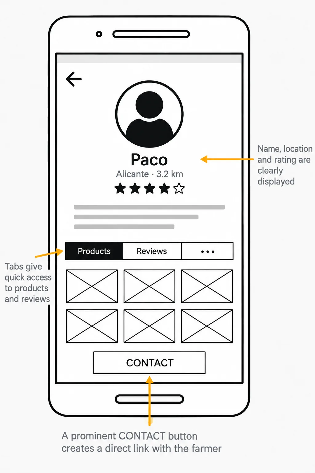
From wireframes to a clickable prototype
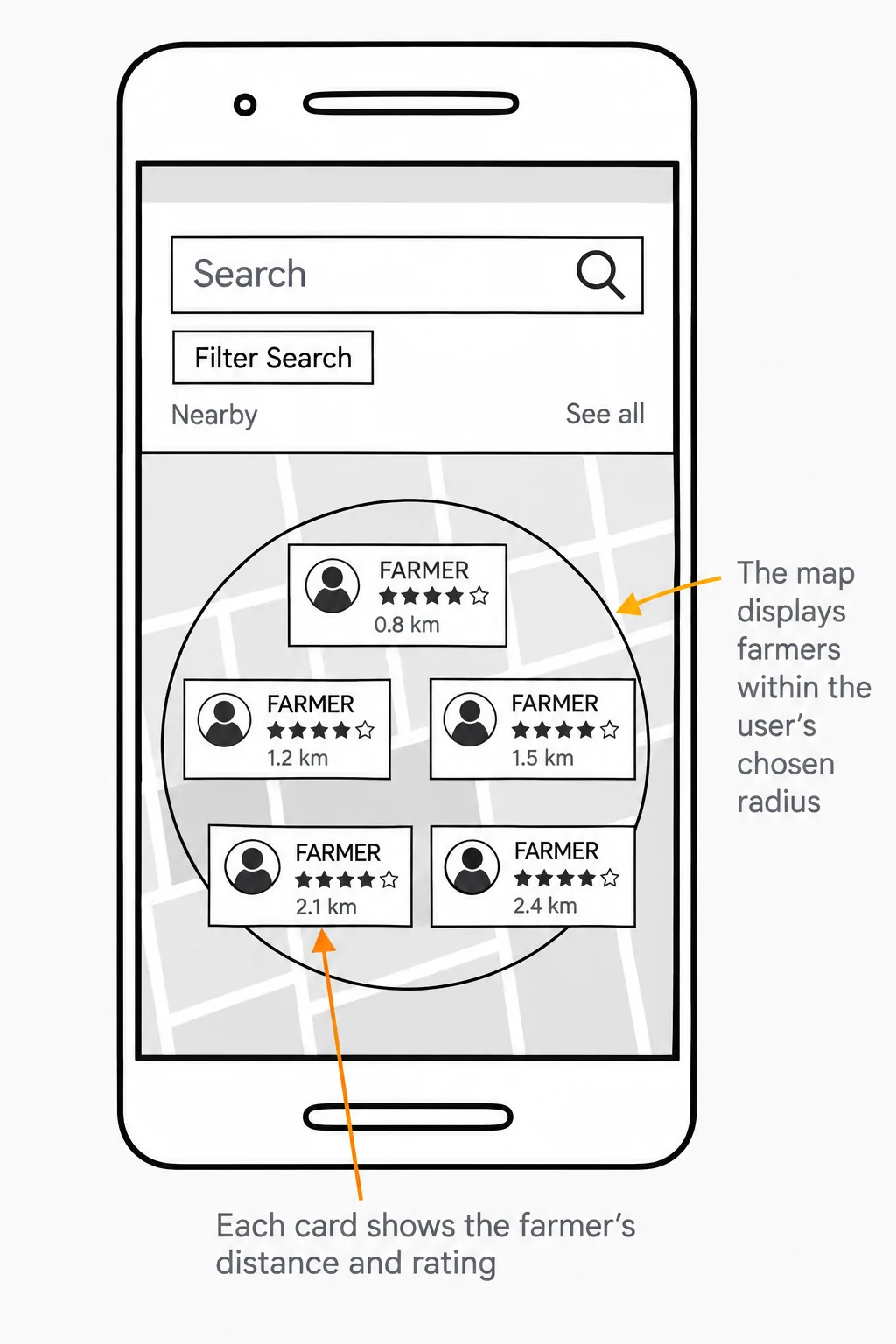
The prototype was not a demo. It was the thing I used to find out where I was wrong.

05 · Testing
Two rounds, and what they changed
Round 1
People were unsure how buying and selling actually worked, and asked for filters — distance, category, price — to make searching manageable. The first round said the concept was understood but the mechanics were not.
Round 2
The second round was more specific: add a confirmation step before publishing a listing, make the navigation icons clearer, and fix the visual hierarchy of farmer profiles so reviews and products stop competing.
What I changed

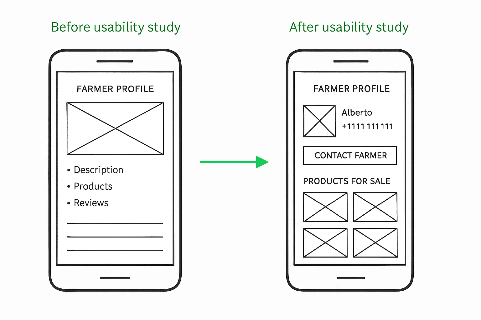
The listing screen gained a map preview and filters by category and distance, so finding someone nearby stopped being guesswork. The farmer profile was rebuilt around action: contact details, a clear Contact farmer button, and a defined section for what is for sale.
06 · Interface
From mood board to screens
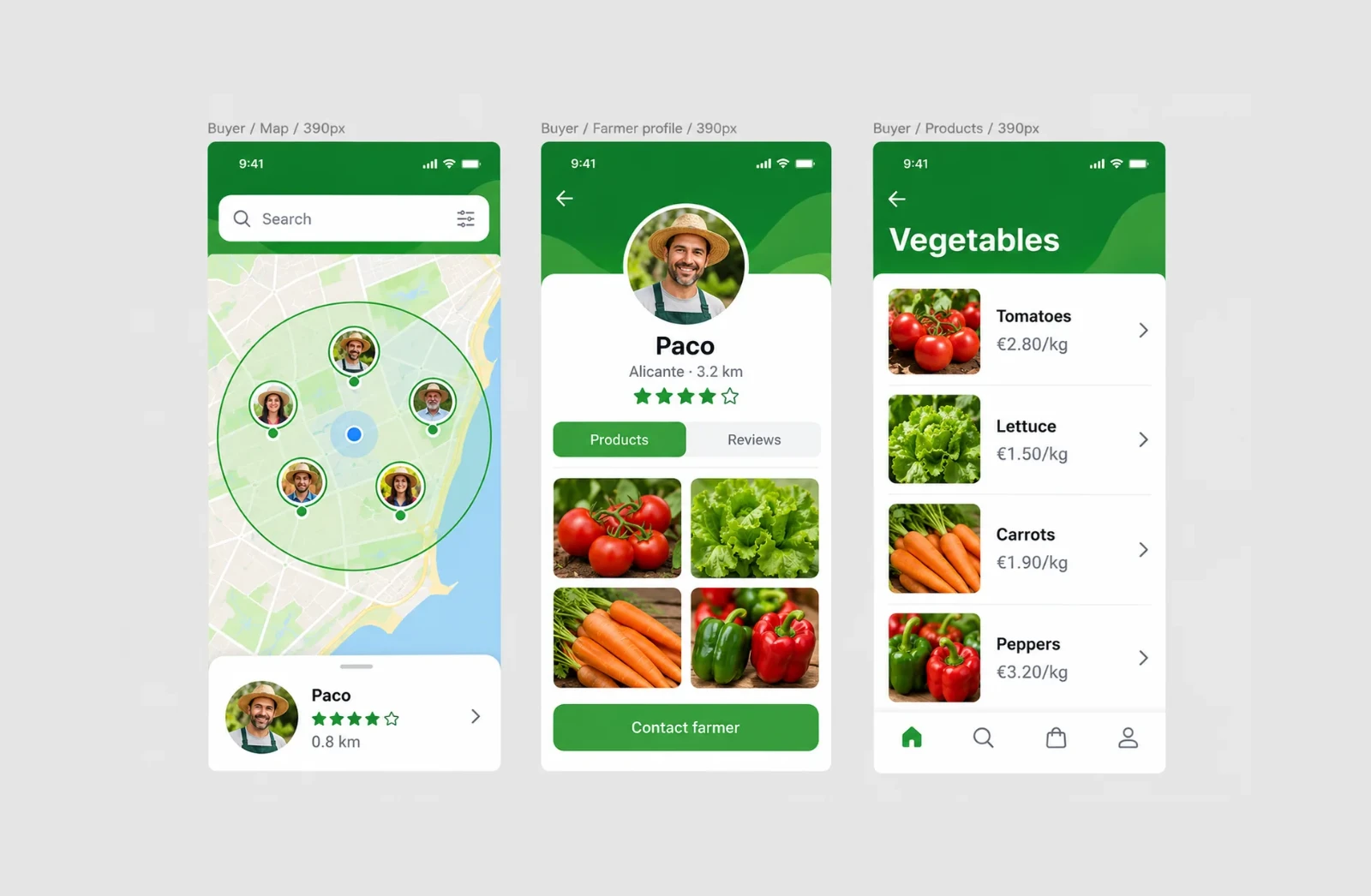
The interface came last, once the structure had survived contact with real people.


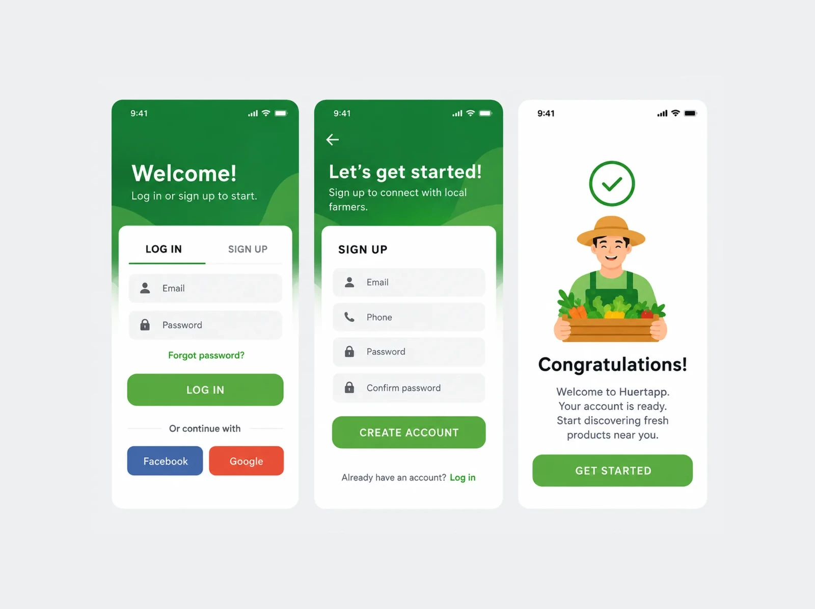
The mood board fixed colours, type and tone before any screen was designed. The pattern library turned those decisions into reusable components — the same discipline a design system gives you in a larger product, at a smaller scale.

What I learned
What I would do differently
Testing covered the buying side far better than the selling side. The flows a farmer goes through to publish and manage listings were designed on evidence I gathered early and never re-tested — and that is where I would start if this continued.
Logistics is the other open end. Delivery came up in every conversation with farmers, and the product acknowledges it without solving it. Pretending otherwise would have been the easy way to finish the case.