HP
Ecommerce projects at HP
The HP Store, sold across regional platforms, with a worldwide UX team behind it.
I worked as part of HP’s worldwide UX team on the HP Store across the Americas, EMEA and APJ, in the pod focused on the pages that matter most for conversion: home, product listing and product pages. Most of what I did lived between research and development: flows, interactive prototypes to test ideas before they were built, and a first UI pass on new features, with components designed for every viewport and always starting from mobile. Three of those projects are documented below.
01 · Conditional flows
A form with 30+ outcomes and one right path
More than thirty possible outcomes, and every customer should only ever see the one that applies to them.
What it is
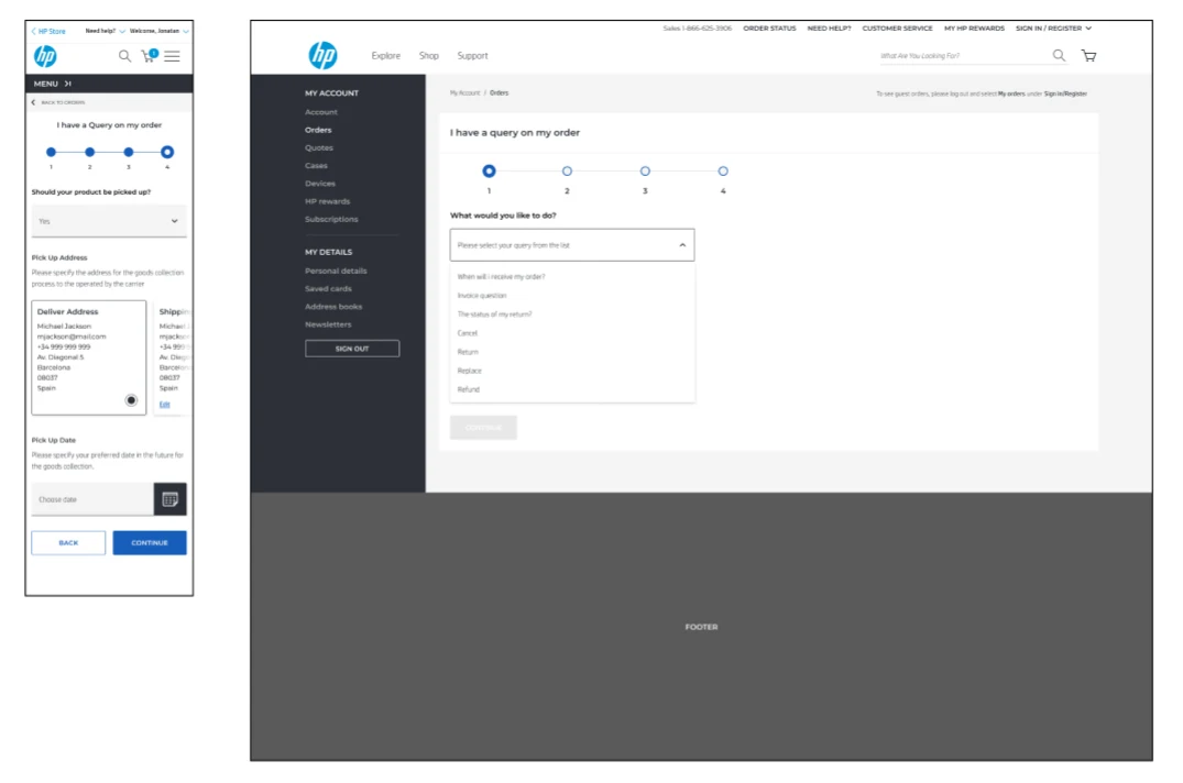
A request flow where each answer changes what comes next. The complexity is not visual, it is structural: with dozens of possible endings, the risk is showing people questions that do not apply to them, or leading them to a dead end. The work was mapping every branch, then hiding that map behind a form that feels short. It lives in the account and handles returns, replacements and refunds, where serial numbers, pick-up dates and product references all change what comes next.
Process
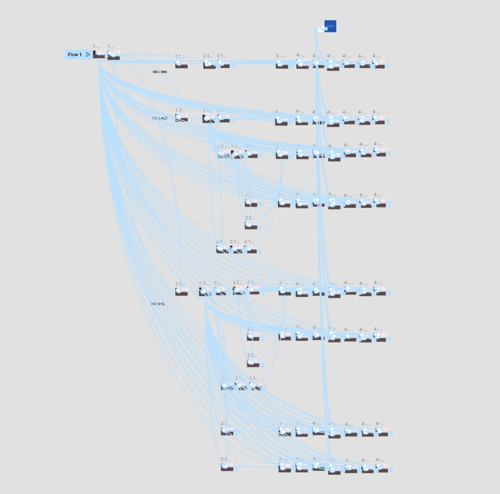
Before drawing anything I mapped every branch and outcome, then benchmarked how other large retailers and support sites handle conditional requests. The map became an interactive prototype: not a demo, a working version of the logic that people could walk through. Testing it surfaced the dead ends and the questions nobody understood while changing them still cost nothing.
Working with the design system
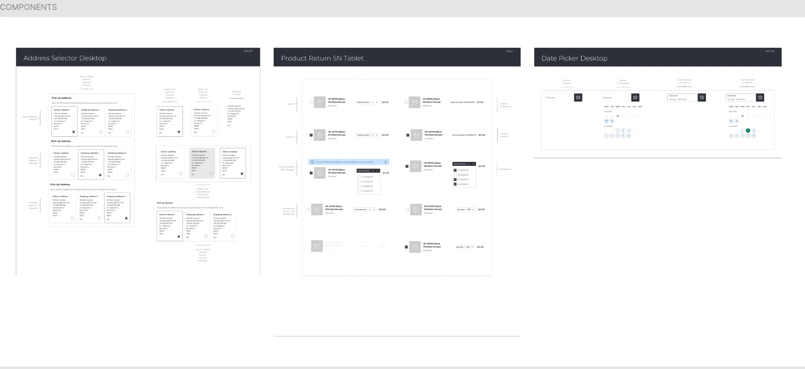
Existing components did not cover cases like picking a product for return, choosing a pick-up date or confirming an address. I worked with the design system team to create new components from scratch and to rethink use cases the system had not considered, each with its own states and variations for desktop, tablet and mobile.
What changed
Fewer people abandoning halfway, and fewer requests arriving with the wrong information attached. Figures belong to HP, so I describe the direction rather than the numbers.
02 · Bundles
Bundles on the product page
Accessories sell better next to the product than in a separate aisle — if they do not get in the way of the main decision.
What it is
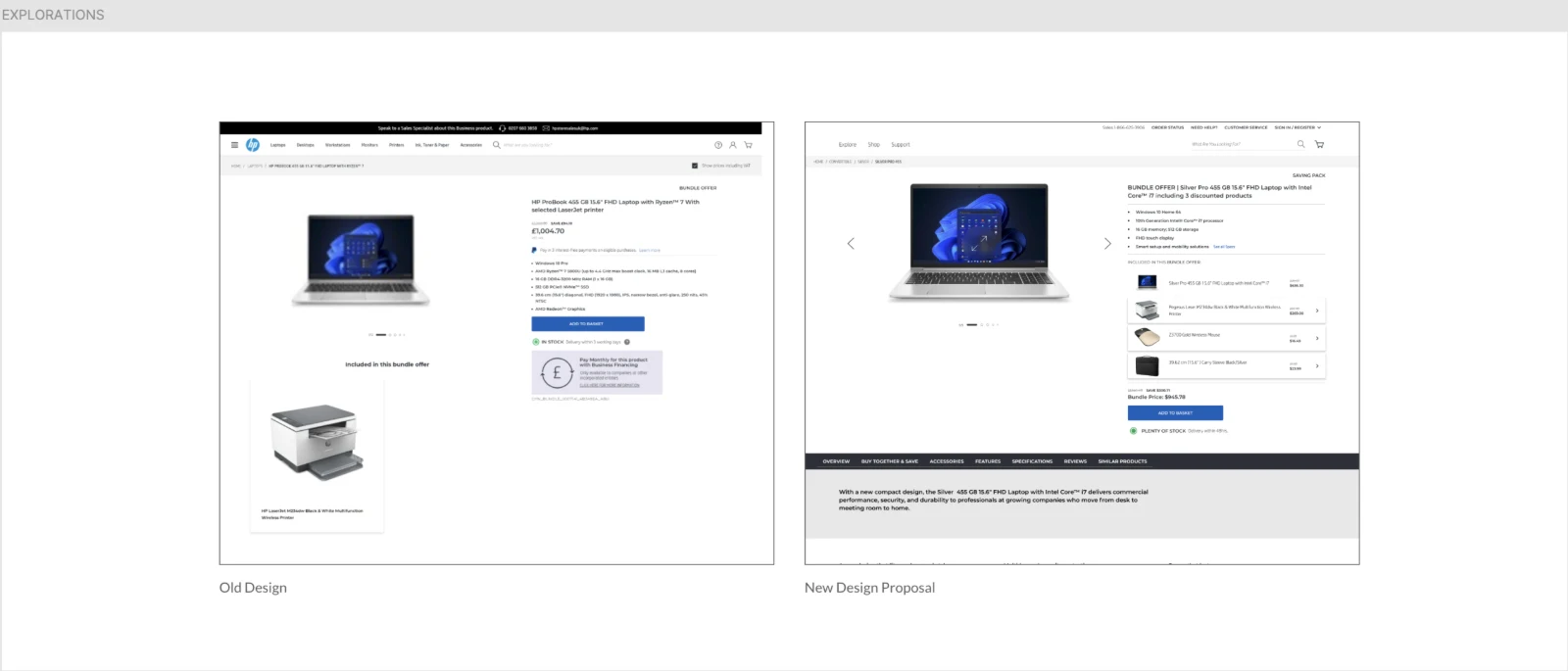
A way to offer related products on the product page without pushing the main purchase decision down the screen. The design had to make the bundle understandable at a glance — what is included, what it costs together — while keeping the primary add-to-cart action untouched.
Process
I started with a benchmark of how technology retailers present bundles and accessories on the product page, and with the guidelines already established for product page hierarchy. From there: wireframes for placement and density, UI, and a test to settle the trade-off between visibility and distraction.
Two versions, one live test
The previous version was not getting the results the business expected. With the research team I ran usability studies to validate what needed to change, then designed two new versions that presented products, specifications and prices in a clearer hierarchy, so people understood they were buying a set and could see the advantage over buying each item separately. Both went into a live A/B test, and the data chose the winner.
What changed
The winning version from the A/B test became the one used across the store. Figures belong to HP.
03 · Quick view
Quick view, proposed and shipped
Not every idea starts with a brief. This one started with a prototype.
What it is
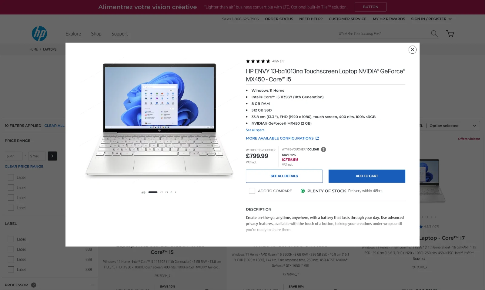
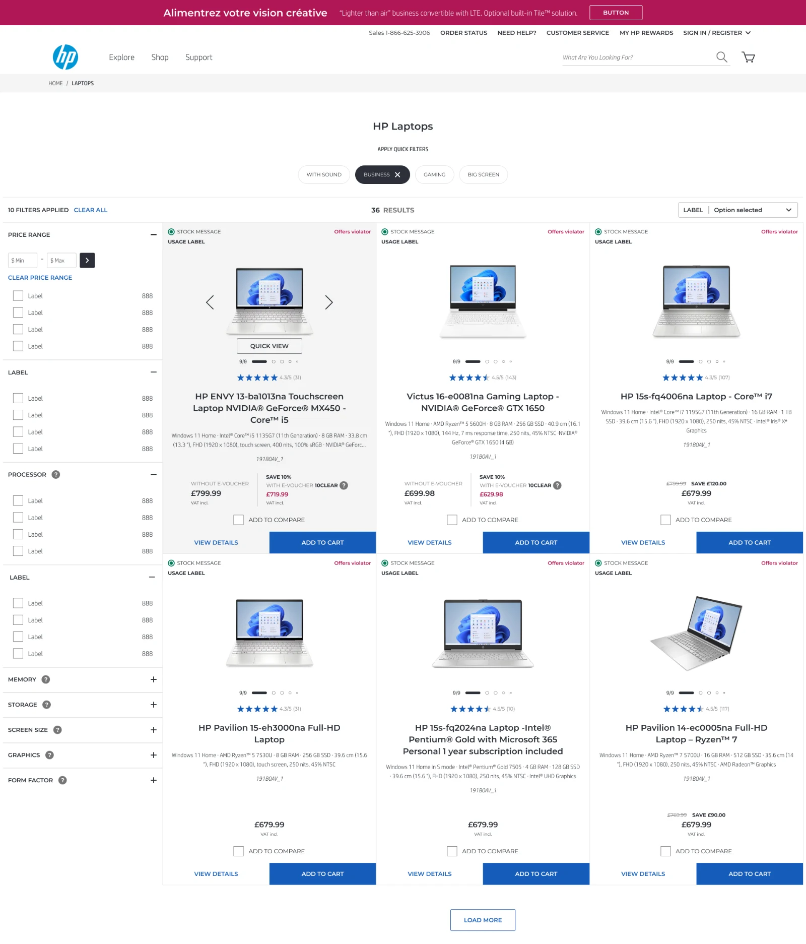
A quick view that opens product details over the listing, so people can check a product and carry on browsing instead of going back and forth between pages. I proposed it, prototyped it, and it made it into production.
Process
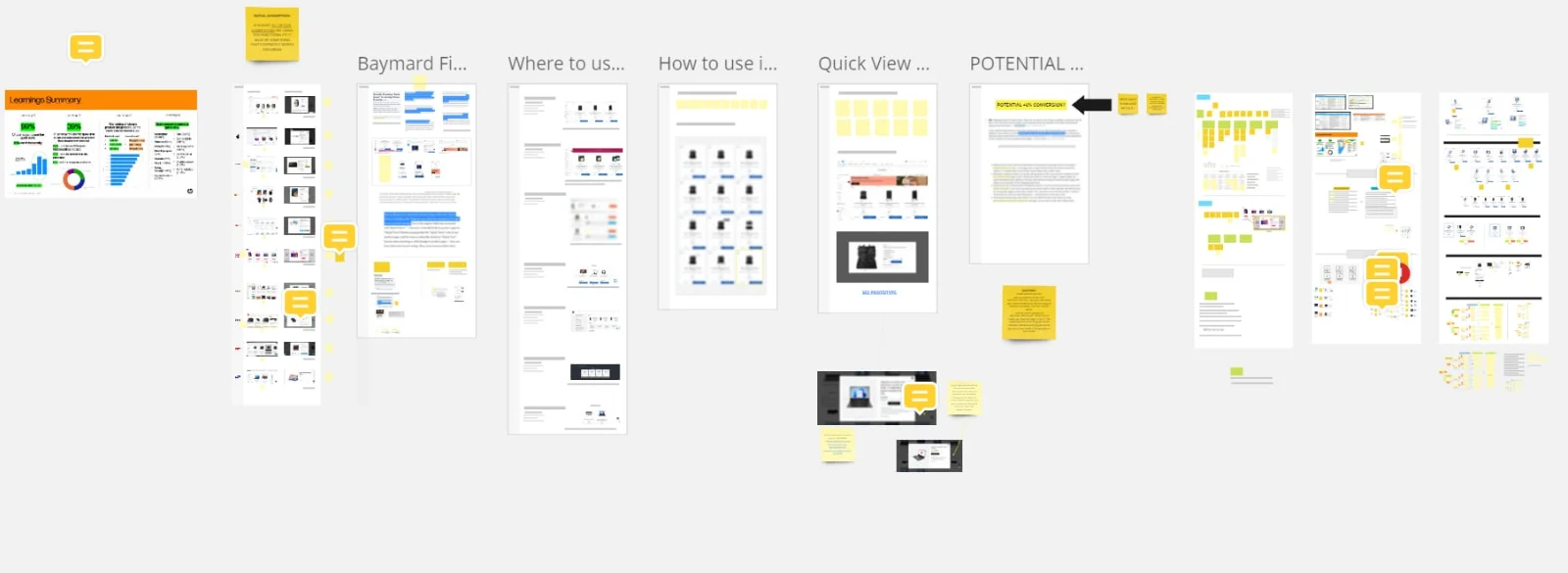
I started by looking at how other retailers implement quick view and where it helps or gets in the way, gathering the findings on a shared research board, built a working prototype to make the idea tangible, and used it to argue the case before asking anyone to build it.
An idea nobody asked for
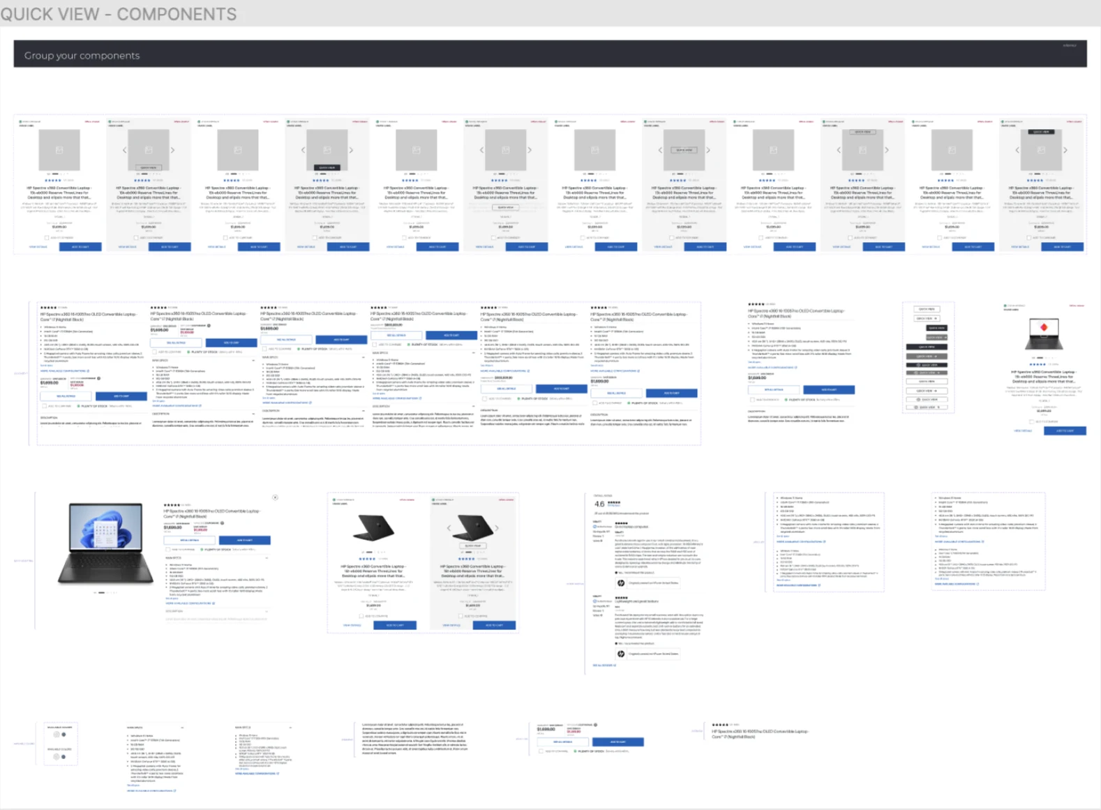
Quick view started on my own initiative. In categories with long catalogues, people struggled to move through the range efficiently, going back and forth between listing and product page. My hypothesis was simple: the easier the catalogue is to scan, the more likely people are to find what they came for. I validated the first assumptions with the research team through user testing, then finished with a high-fidelity prototype and its components and interactions.
What changed
Fewer round trips between listing and product page, and a faster path to cart for people comparing several products. Figures belong to HP.
Also at HP
The rest of the work
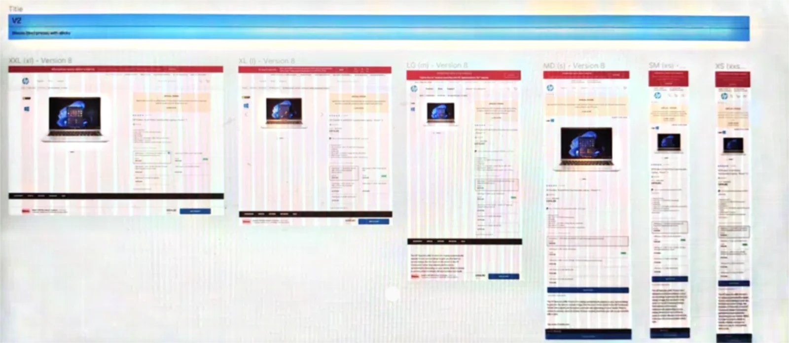
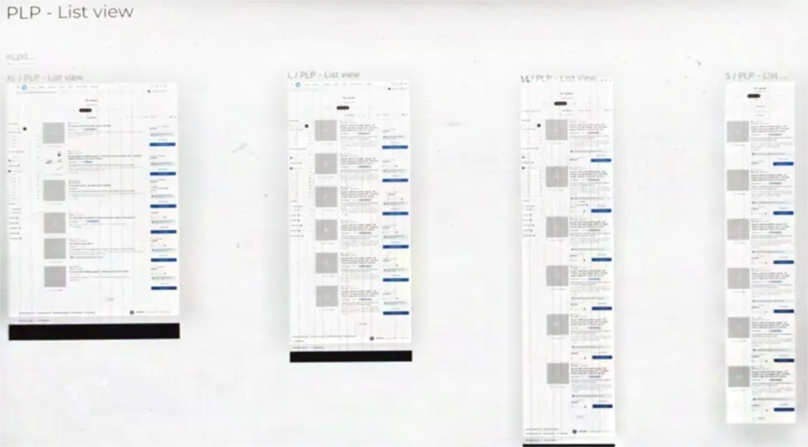
Beyond these three, my work at HP ran across the whole store. A/B tests on product pages and listings — video as the default media, a quantity selector, product recommendations, a store landing page. Cross-sell in the basket, supply compatibility offers and stock indicators. Multiple tracking numbers in the account, a contact widget for EMEA, a privacy banner and modal, a footer aligned across regions, a mobile page builder for LATAM, and new components for the team’s design system. Two more worth mentioning: making the PayPal financing message more visible in list-view product listings, and concepts and iterations for a computer configurator, where people build a machine by capacity, features and extras, designed across six breakpoints from XXL to XS.