Mammut
Ecommerce projects at Mammut
Swiss outdoor brand, founded in 1862, selling climbing, mountaineering and outdoor gear online across 20+ markets.
I work in-house across almost every surface of the store, from the first product search to the account where customers come back. Everything starts on the smallest screen and scales up from there. Four projects are documented below; some details stay out because they are confidential.
01 · Loyalty
A loyalty programme, built from zero
I led the UX and the strategic decisions of Mammut’s loyalty programme — from its first structure to the interface customers use today.
Today it is a programme with more than 100,000 members.

The problem
Before this project there was no loyalty programme at all. A customer who bought once had no reason to come back to the store rather than to any other retailer carrying the brand, and no reason to create an account in the first place.
The brief was to build that relationship from zero: give people a clear incentive to sign up, and a reason to keep buying directly from the brand over time. Everything had to live inside the existing account, not as a separate product bolted on the side.
What it is
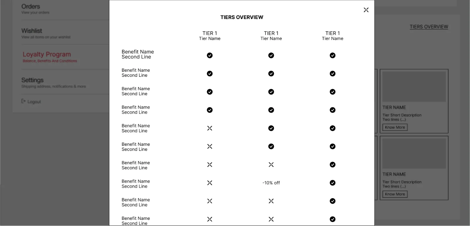
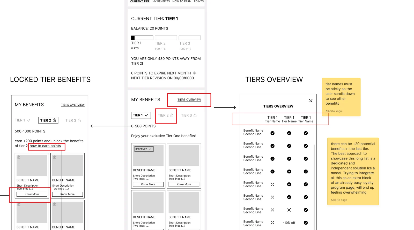
A dedicated loyalty section inside the customer account. Members move through three tiers — Adventurer, Explorer and Guide — by earning points. The page shows the current tier, the points balance, how far the next tier is, and what is needed to keep the current one before the review date. Benefits are grouped by tier in a visual grid, so members see what they have and what they would unlock.
Process
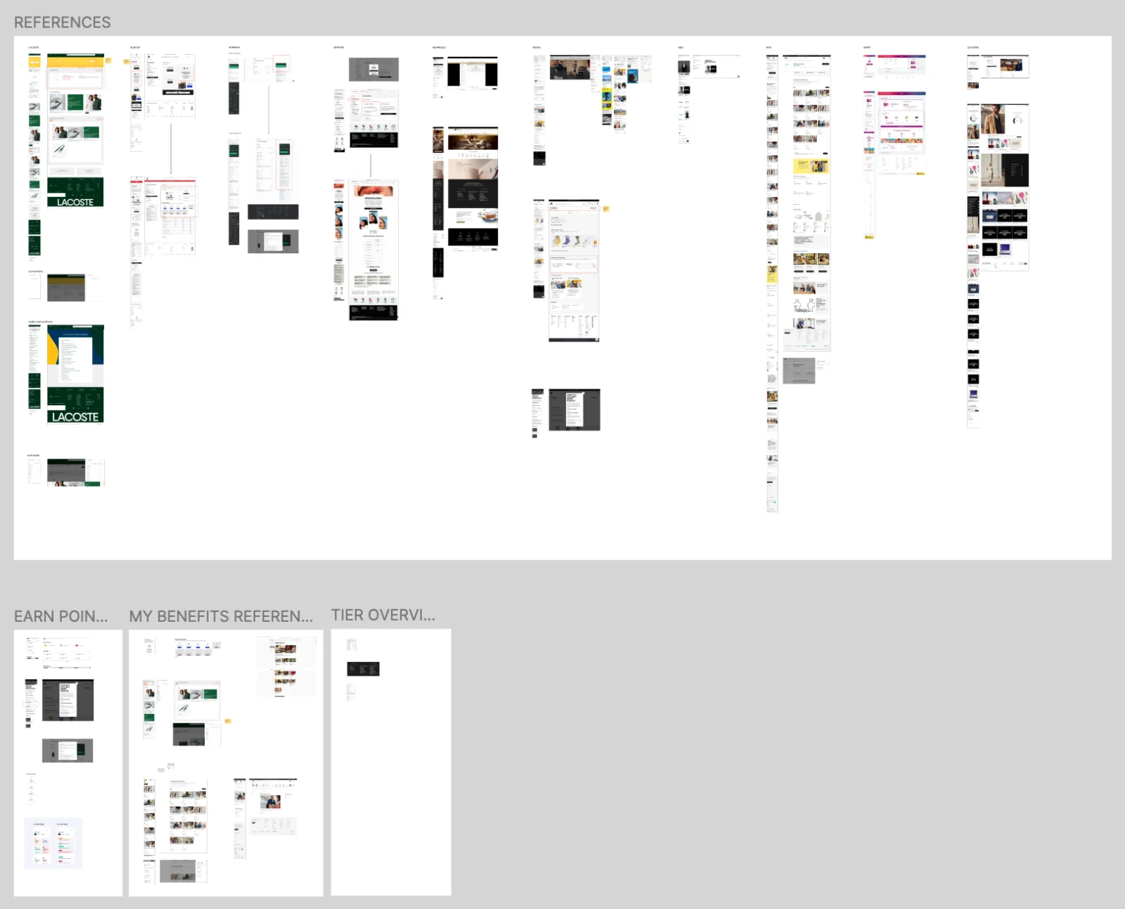
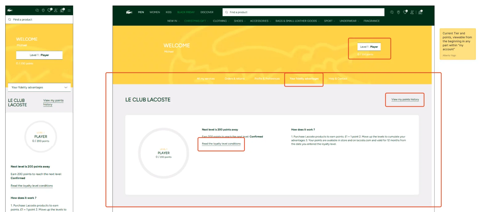

The programme started as structure before it had a look: tiers, balance, progress and benefits laid out for both breakpoints. One early direction was to make benefits more visual than a list, so the value of moving up a tier is obvious at a glance.
A decision I had to defend
The most debated question was how much of the programme to show upfront. One option was a progress bar focused only on the current tier and the next one, with the full ladder behind an extra interaction. It kept the screen simpler and put the attention on the next step.
I argued for showing every tier from the start. People join a programme when they can see where it leads, and a single glance at the whole ladder answers that. Hiding the other tiers behind a tap meant relying on an interaction many people would never make, and losing the context that makes the next step worth taking. That version shipped, and it is the progress bar at the top of the account today.
02 · Compare
A compare tool for technical products
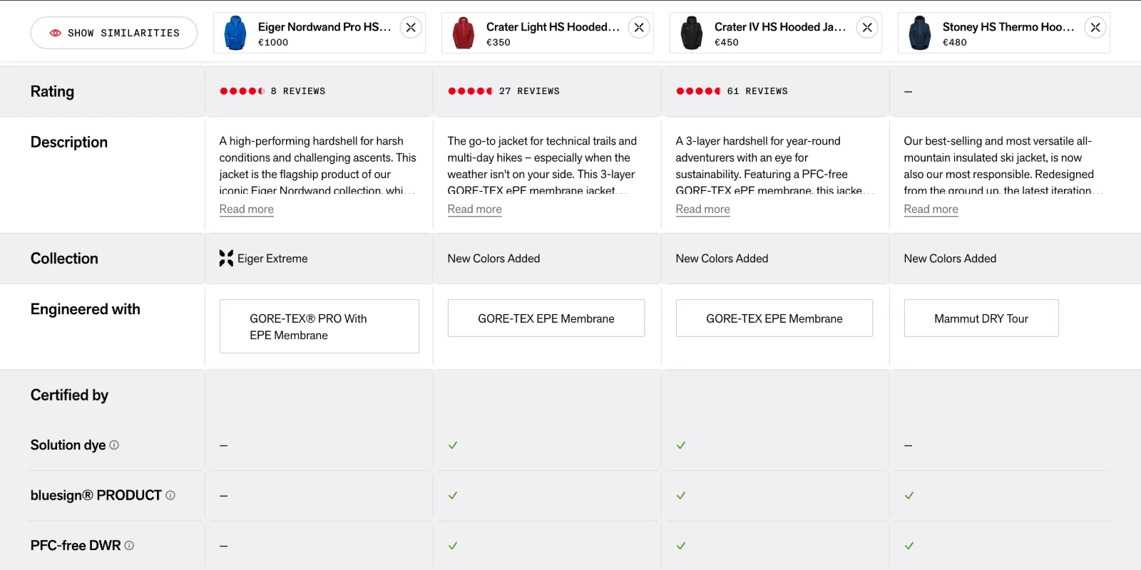
For technical gear, the difference between two jackets is in the specifications, not in the photos.

The problem
Technical gear is bought on specifications: membrane, weight, insulation, what each piece is built for. Two jackets can look almost identical in the photos and be made for completely different days in the mountains.
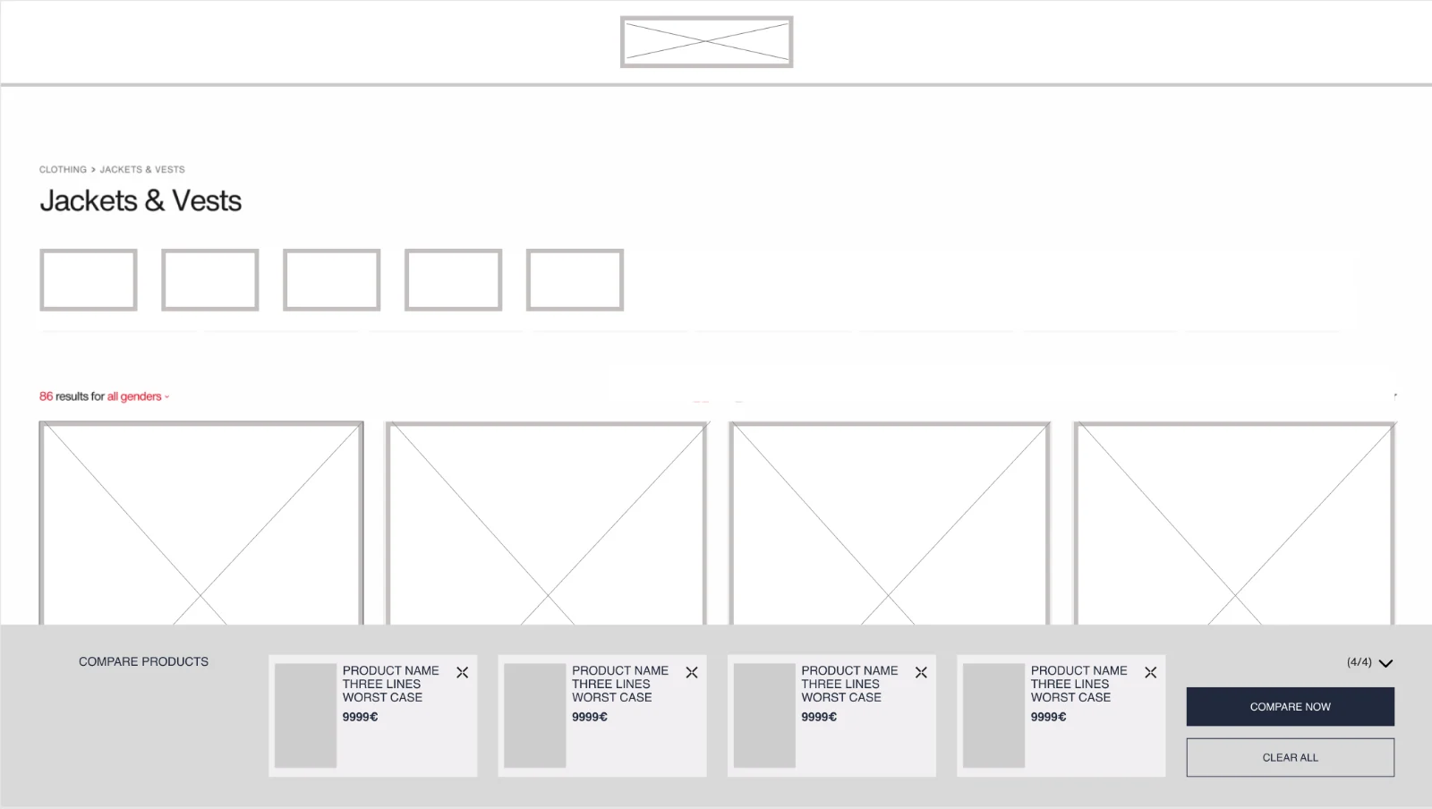
Without a way to compare, people did it by hand, jumping between product pages and trying to remember what each one said. The store needed a compare tool that worked from where people actually browse, the listing and the product page, not only from a separate page they had to find.
What it is
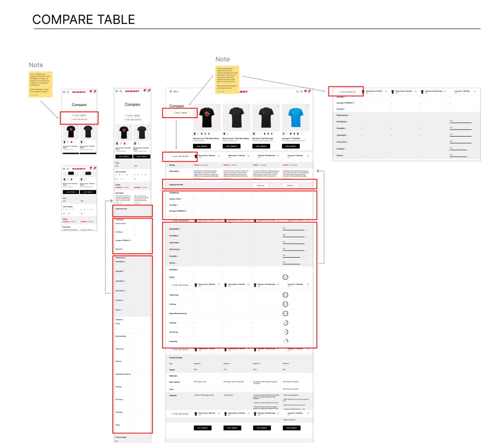
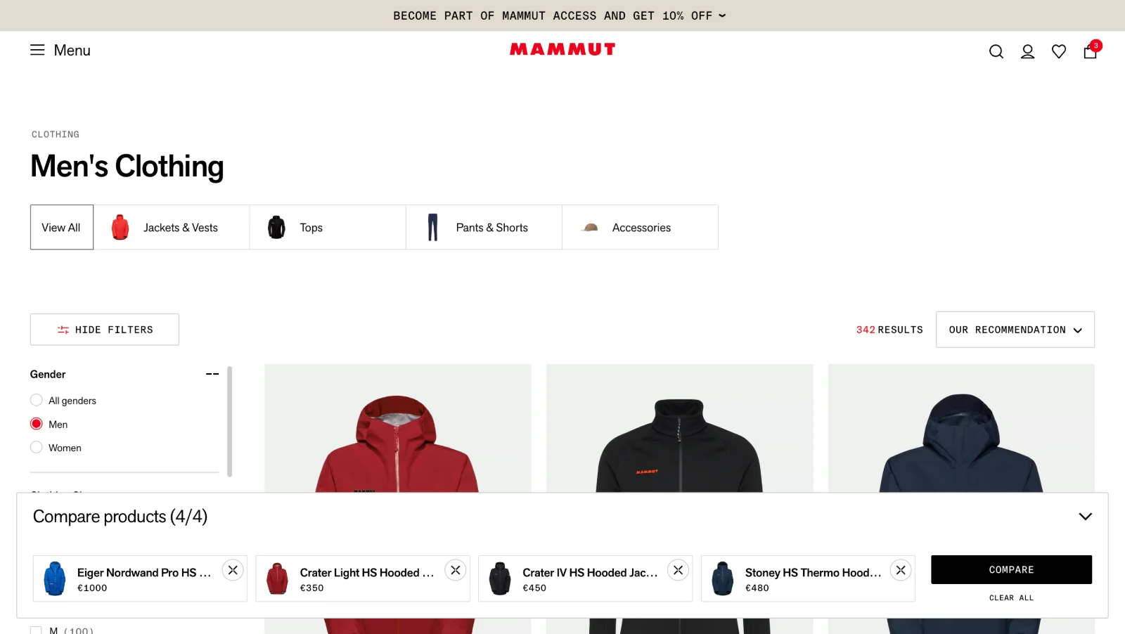
A comparison page where products sit side by side with their rating, description, available sizes and colours, and technical properties such as waterproofing, wind protection, breathability and insulation. On long pages, a sticky bar keeps the products being compared visible while scrolling.
Process
A decision I had to defend
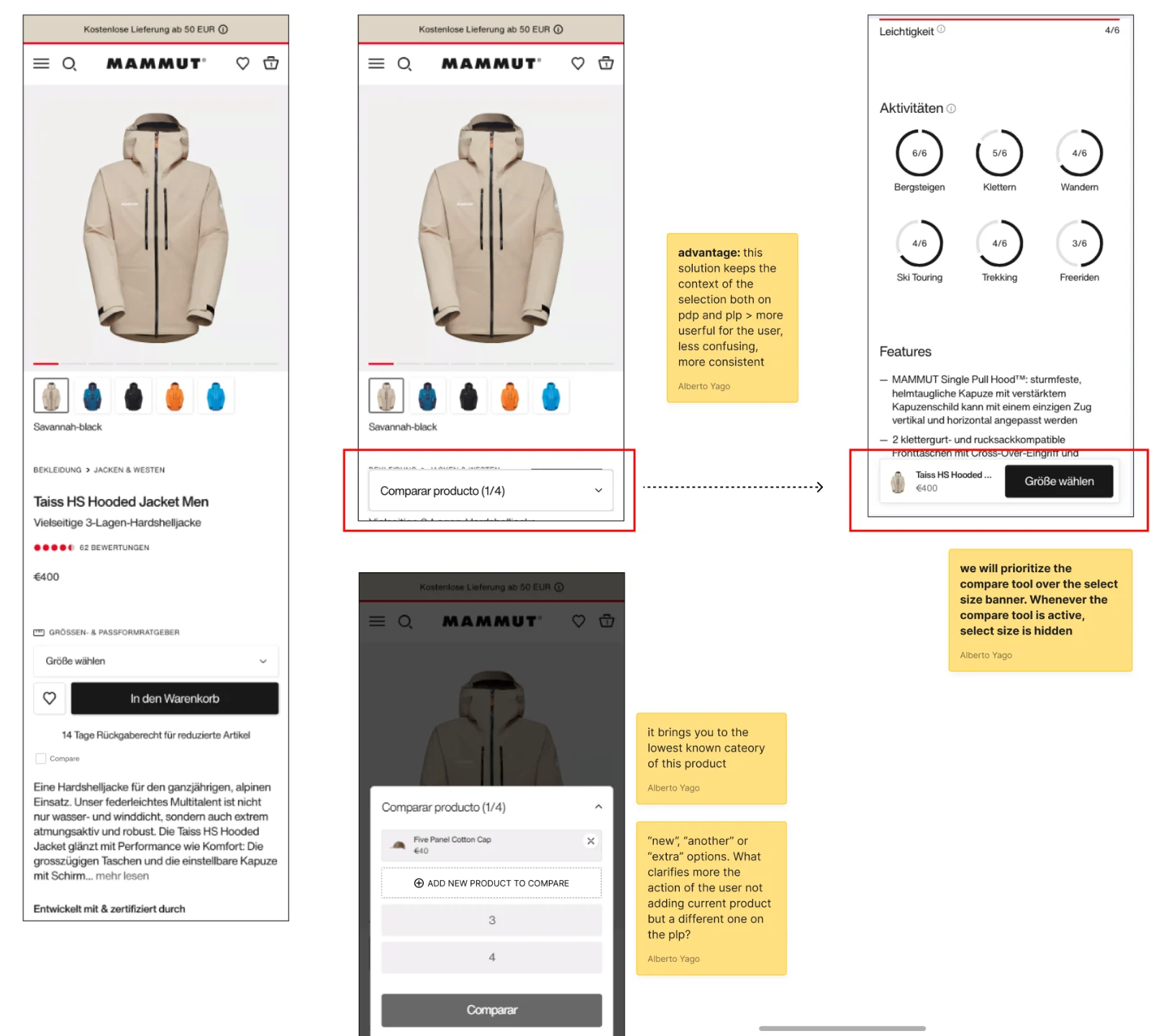
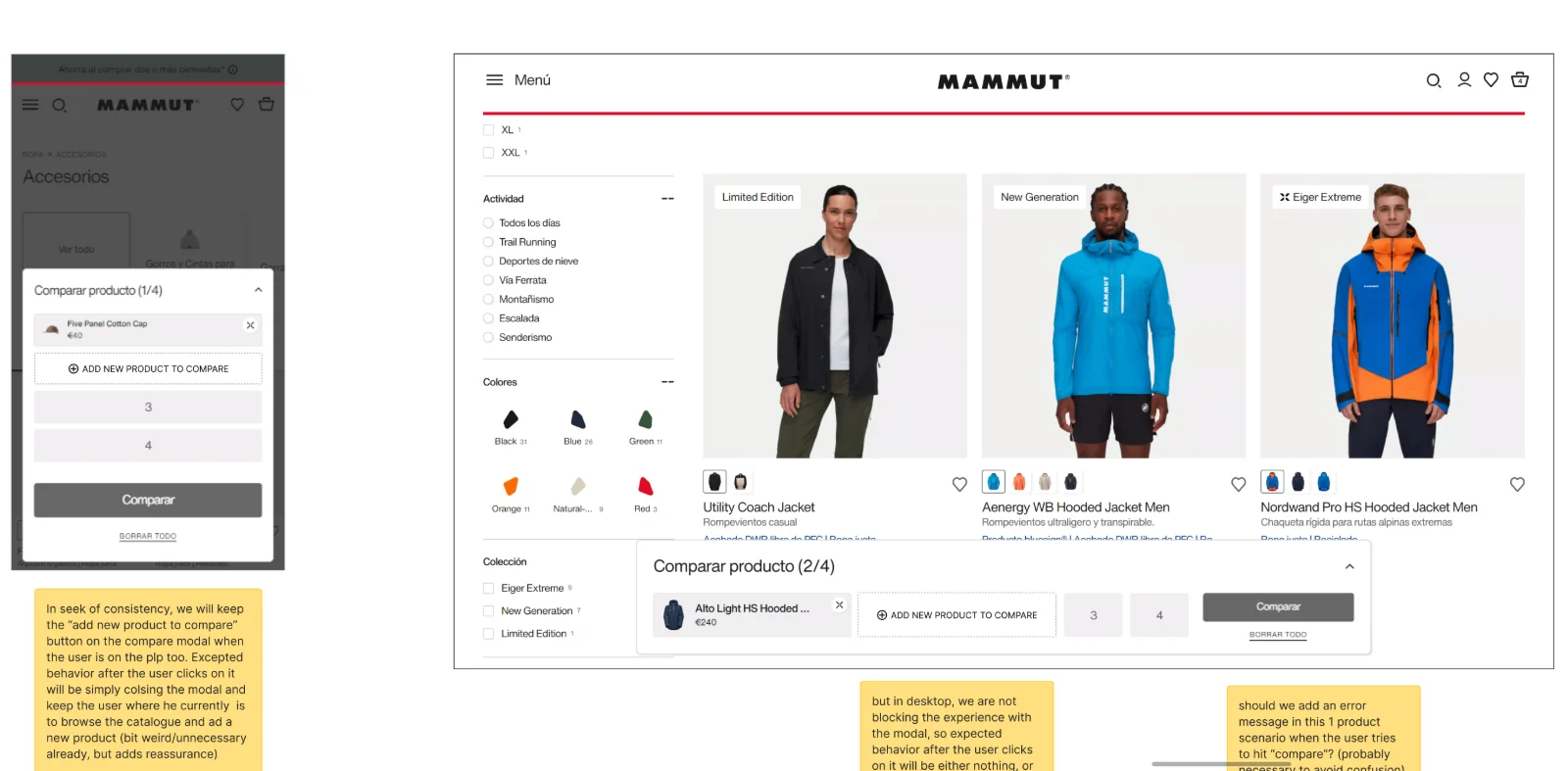
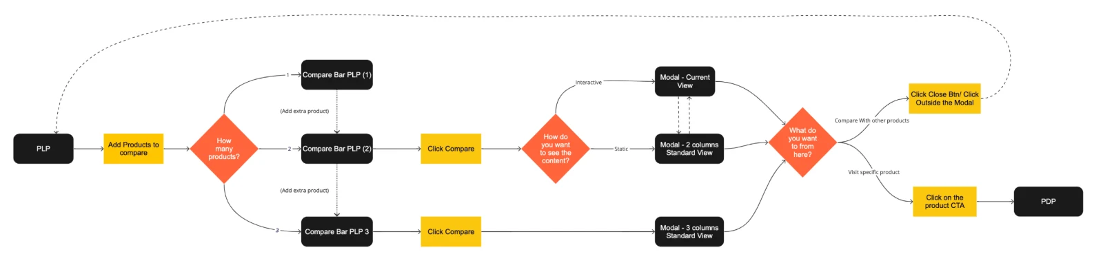
The brief suggested one flow: when someone added a product to compare from the product page, send them back to the listing to pick the next one. It was simple, but it moved people out of the page they had chosen to be on, and left them wondering where their selection had gone.
I argued for keeping them where they were. The selection lives in a compare bar fixed at the bottom of the screen, and it follows people from product page to listing and back without losing anything. It can be collapsed at any time, so it never covers the catalogue or the product itself. That kept the experience consistent across both pages, and it is the version that shipped.
03 · Pro Program
Verification and membership for a pro programme
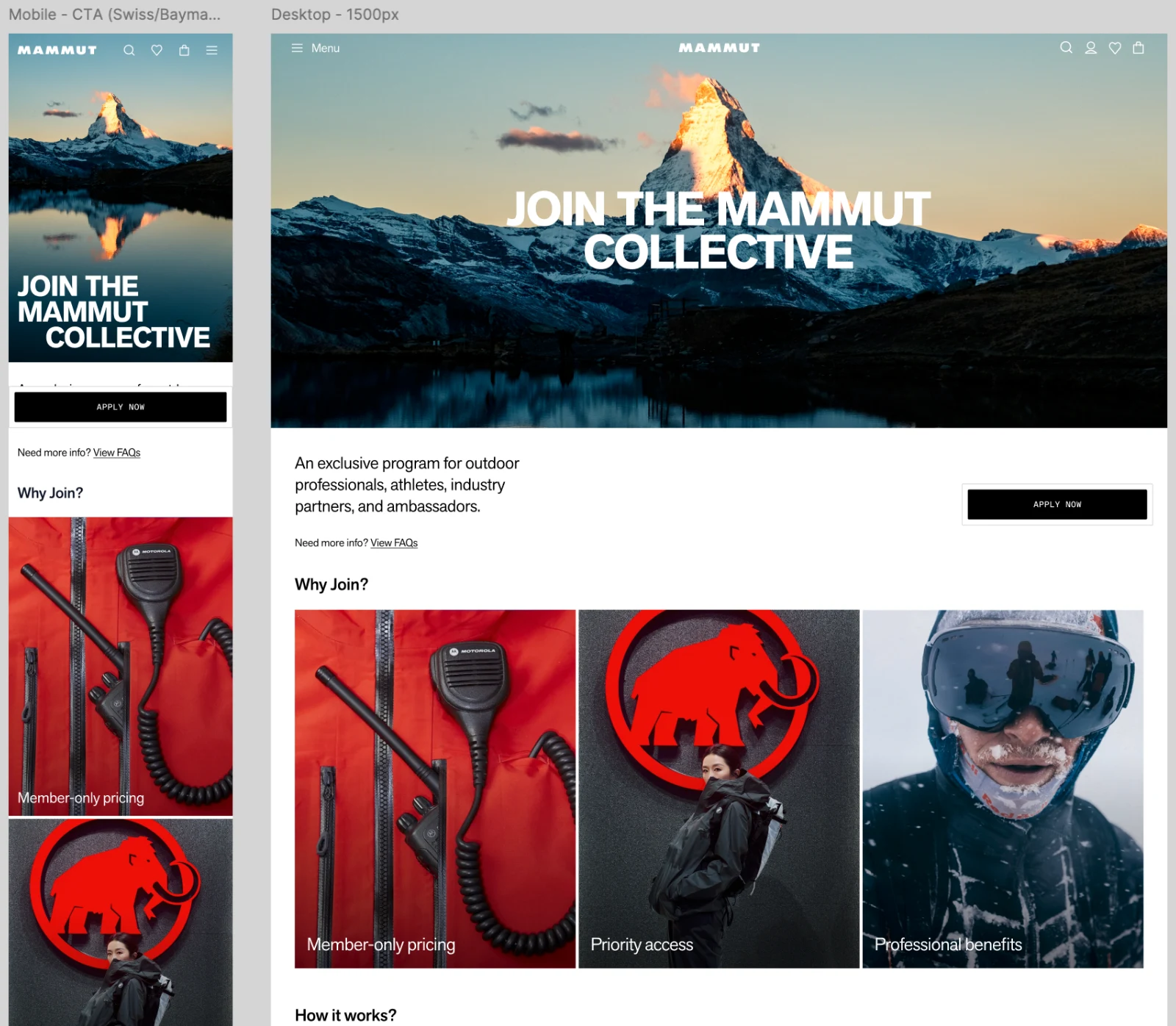
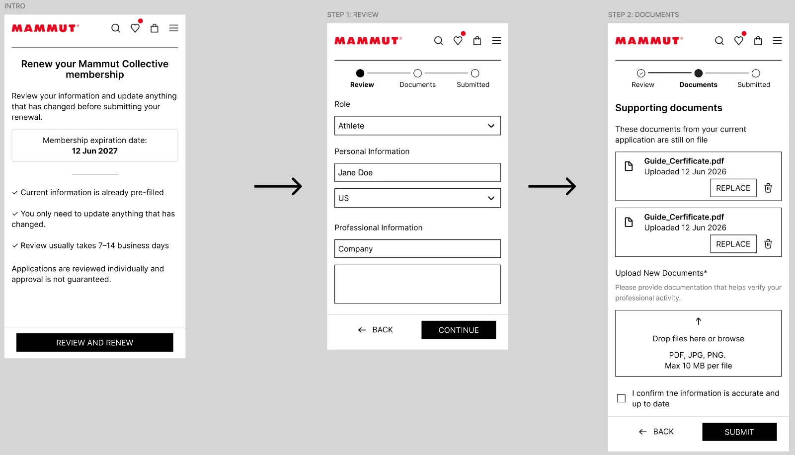
The Mammut Collective gives guides, instructors, athletes and industry partners access to dedicated benefits. Where loyalty rewards what people buy, this is about who they are: eligibility, verification and a membership that has to be renewed.
The problem across the industry
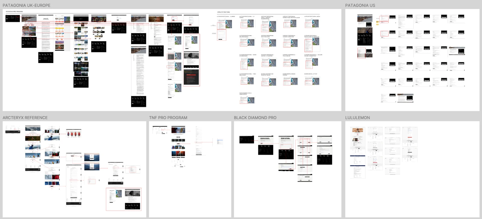
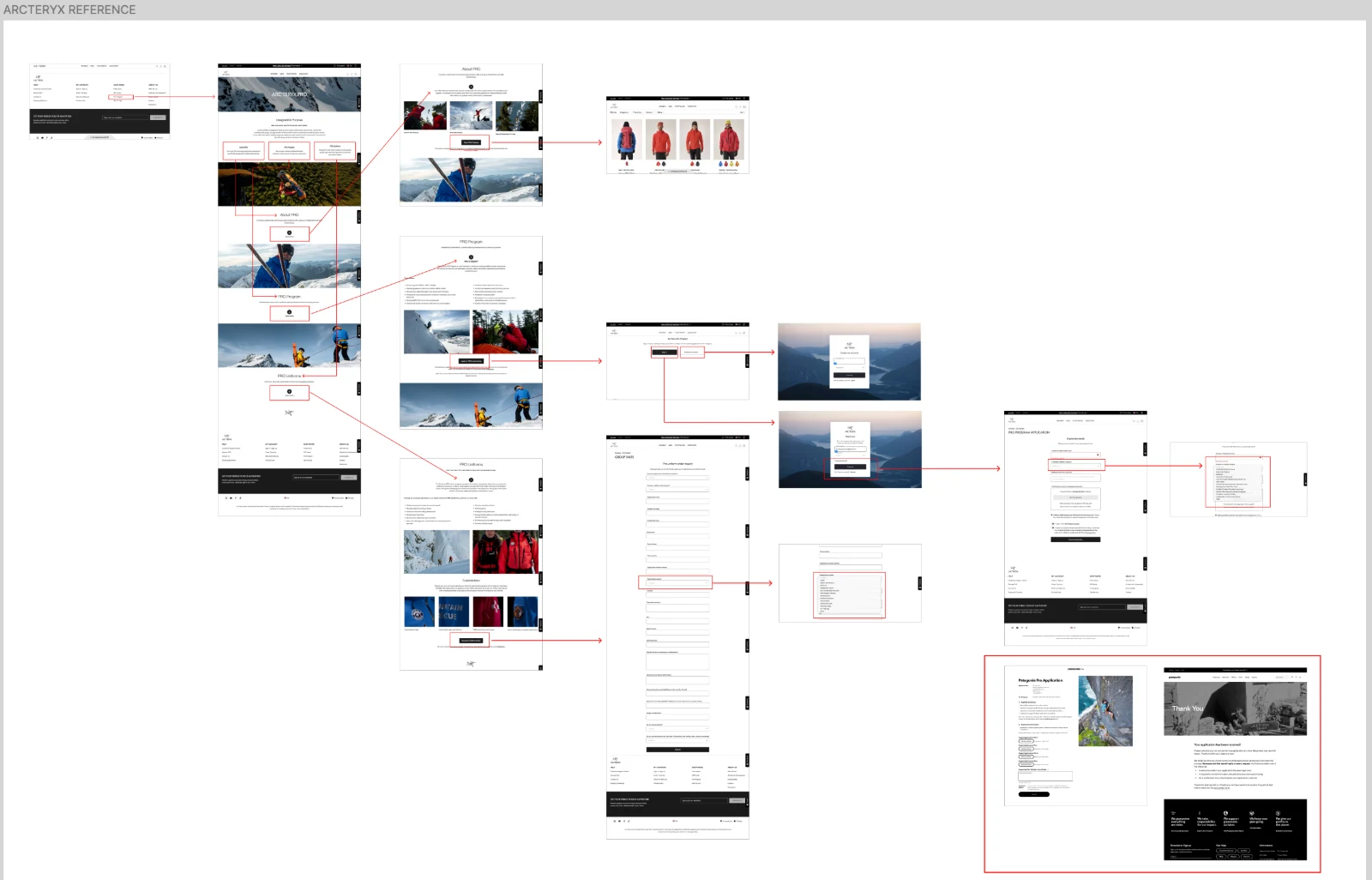
Most premium outdoor brands run some form of pro programme, and they tend to fail in the same places. Eligibility is hard to read before applying, so people apply and hope. Once the form is sent it disappears into a black box with no status and no timeline. Restrictions and limits often surface only at checkout, and renewal usually means starting the whole application again.
Brands carry a tension of their own. The more open a programme is, the more it drifts into general discounting and loses the exclusivity that makes it worth joining. The stricter it is, the more friction genuine professionals meet along the way.
What I set out to do
Clear eligibility upfront. People should know whether the programme is for them before they spend time on an application.
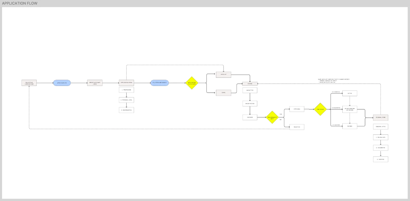
No black box. A visible status from the moment someone applies to the final decision.
Renewal as a check, not a restart. Members confirm what has changed instead of applying again.
Benefits where people already shop. Once approved, the programme works inside the account and at checkout without extra steps.
Research
Structure
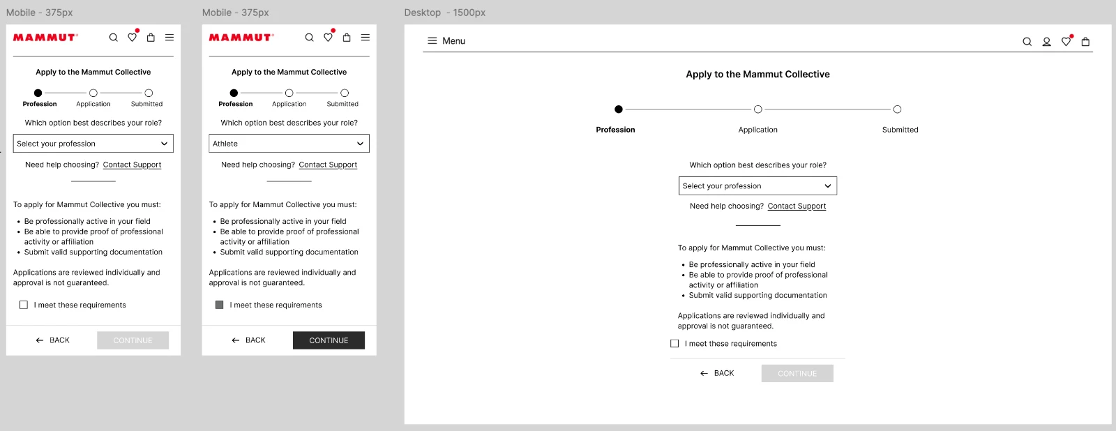
04 · Checkout
A checkout rebuilt from the ground up
A full redesign on a new commerce platform, which finally made possible things the old stack could not do.
The redesign
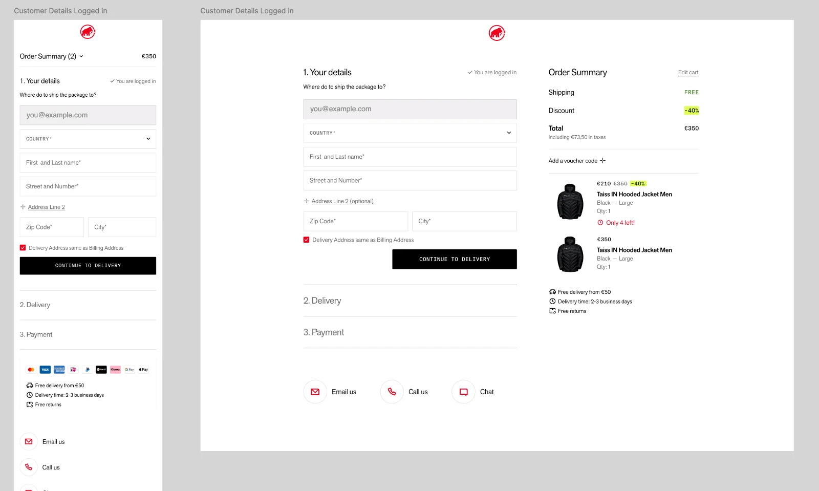
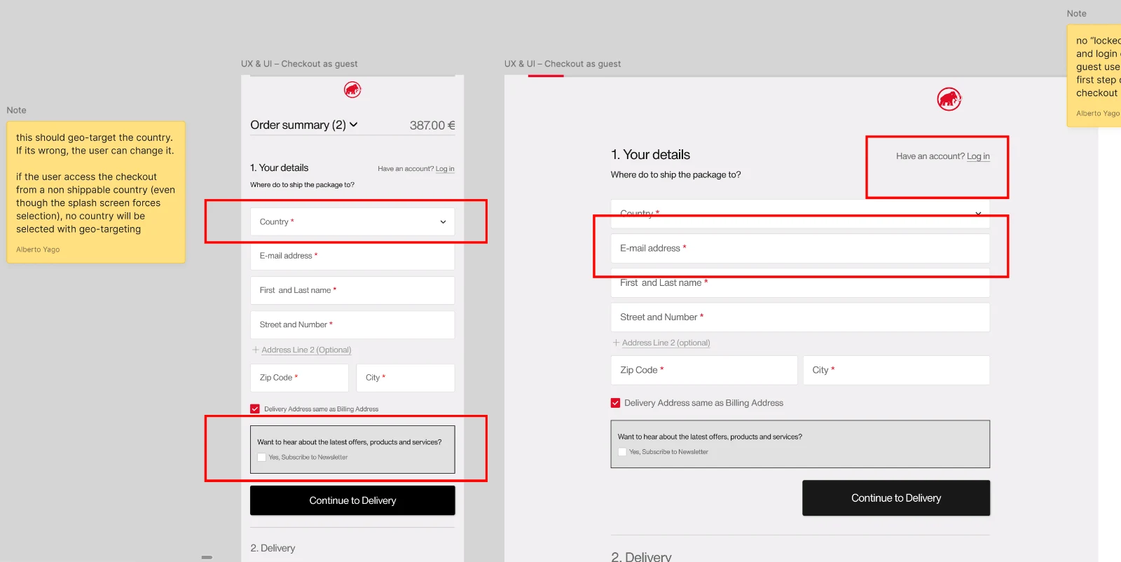
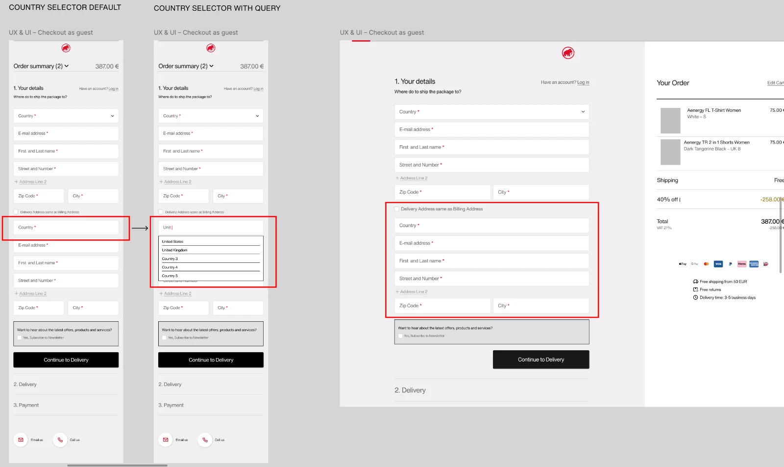
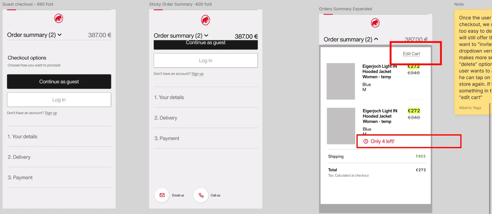
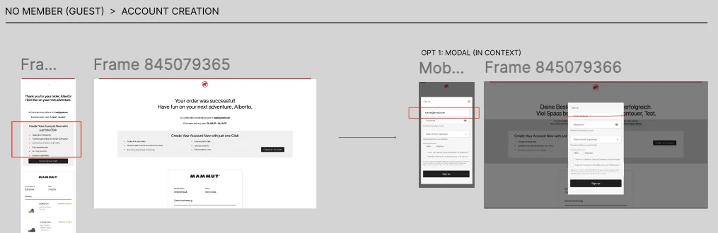
A change of commerce platform removed the limits we had been designing around, and turned what could have been a patch into a full redesign. The new checkout starts by asking people how they want to continue — sign in, continue as guest, or create an account — with a flow adapted to each choice instead of one path that half fits everyone. Input fields were reorganised and reduced. A country selector now sits at the start of the flow: not possible on the previous setup, and something international customers had been asking for. The cart summary was reworked for mobile, the payment section restructured, and the success page reorganised around what people need after paying.
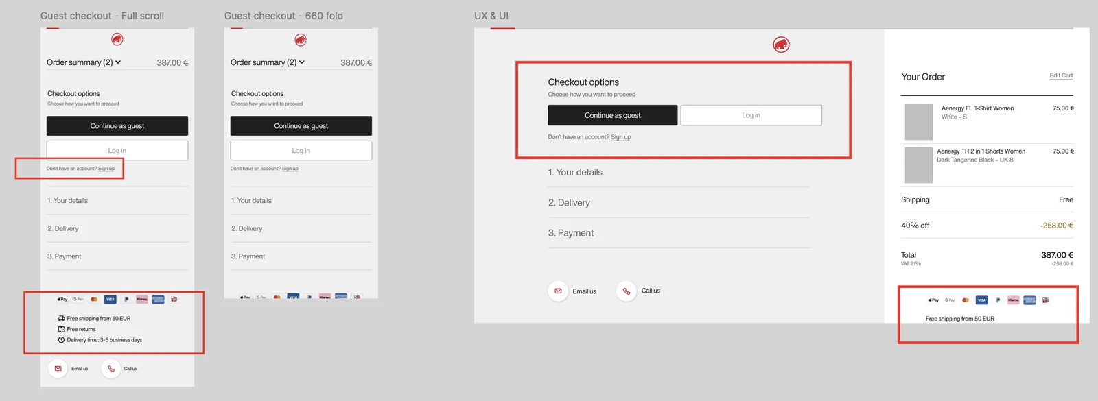
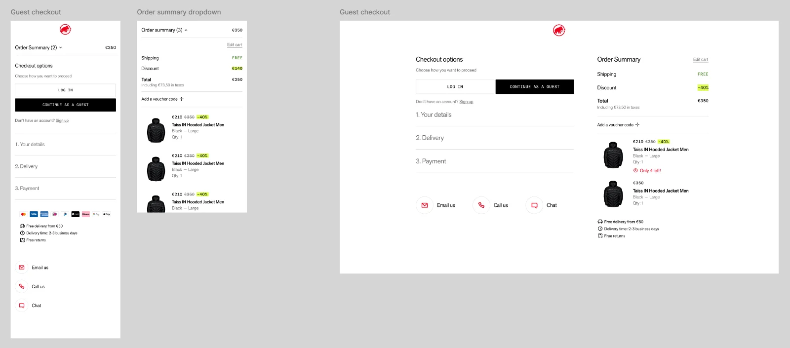
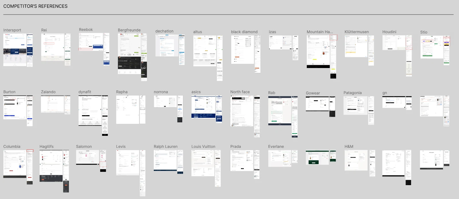
The redesign was grounded in research before anything was drawn: I went through more than 100 checkout guidelines from Baymard Institute and analysed more than 30 competitor checkouts to decide what was worth keeping, changing or dropping. Smaller changes came straight from that work: address line 2 available without cluttering the form, and voucher codes behind a link rather than an open field competing for attention.
Process


Key decisions
Country first. Choosing the shipping country was a recurring source of friction for international customers. A country dropdown now opens the flow, so shipping options, prices and taxes are right before anything else is filled in.
Only the fields that matter. The customer details step asks for the minimum. Address line 2 and the voucher code stay one click away instead of taking space by default.
The cart as a modal on mobile. Reviewing the order no longer takes people out of the checkout. They check what they are buying and carry on where they left off.
Errors written case by case. Every error and validation message was reviewed so it says what went wrong in that specific field and how to fix it, instead of a generic warning.
What changed after launch
After launch, checkout abandonment went down and the conversion rate went up. Customer service also saw fewer contacts about shipping country, addresses and failed payments, and returning customers got a shorter path to paying. The exact figures are internal, so I describe the direction rather than the numbers.
Also at Mammut
The rest of the store
Beyond these four, my work at Mammut spans listing and product pages, filters, the product finder, several account projects, cart, sign-up and the store finder — plus compliance work for the US market around PFAS product information.