Author Name: : Alberto Yago

Date: : October 2021

Location: : Remote/Spain

Skills: : UI,UX Design & Responsive Web Design

ui, ux, web

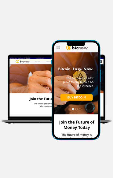
UX/UI Case Study – BTC Responsive Website

Btcnow is a  website for a fictional bitcoin store to help newbies and not technical users to get easily into bitcoin and make their first investments, both digitally or physically with coupons.


The iterative Process:

1

Empathise

2

Define

3

Ideate

4

Prototype

5

Test

1. Project Overview

Project Duration

Sep 2021 – Nov 2021

The Product

Btcnow is a  website for a fictional bitcoin store to help newbies and not technical users to get easily into bitcoin and make their first investments, both digitally or physically with coupons.

The Problem

Investing in bitcoin might difficult and confusing for some people, specially non-technical, elderly, newbiies, etc… We identified that many would be willing to invest in bitcoin if it was easier and more accessible

The Goal

We want the user to be able to buy bitcoin seamlessly without having any technical knowledge. The idea is to become an easy entry gate to the most famous cryptocurrency on Earth .

My Role

UX designer designing an app for this Local Altcoin project from conception to delivery

Responsibilities

Conducting interviews, paper and digital wireframing, low and high fidelity prototyping, conducting usability studies, accounting for accessibility, and iterating on designs

2. Understanding the User

User Research: summary

I conducted interviews and created empathy maps to undestand the users I’m designing for and their needs. A primary user group identified through research was people willing to buy btc online but who lack technical knowledge and feels threatened by scams etc. Another group is people who would only buy bitcoin physically with coupons that feel more “tangible”.

This user group confirmed initial assumptions about the the lack of knowledge idea, but research also revealed that trust and security weren't the only factors motivating users, but other users also wanted an easy way to buy, some support and guidance in the process, payment options, etc..


User Research: pain points

1

Intangible concept

For certain users, bitcoin is a very abstract concept and its intangible nature does not pass trust

2

Security Concerns

Buying bitcoin might still be seen as one of those “internet scams” by certain people

3

Payment Options

Some users feels frustrated with the lack of payment options when buying online.

4

Lack of Information

Some users don't really know anything about bitcoin. The lack of education and information about it, leads to fears and distrusts.

User Research: Personas

PERSONA: THAIS

Problem statement:

Thais is a 34 years old psychology student who feels comfortable with technology who needs an easy, reliable and straightforward way to buy bitcoin online because she lacks information is concerned about lack of security, info and clarity

PERSONA: PACO

Problem statement:

Paco is a 65 years old retired man who “has heard” bitcoin is the future who needs an easy, reliable and straightforward way to buy bitcoin offline because he refuse to buy anything online.

User Journey Map

PERSONA: THAIS

Goal: Buy bitcoin online easily and reliably. Comfortable with technology but wants and easy and reliable site to buy online

PERSONA: PACO

Goal: Buy bitcoin physically easily and reliably. Prefers to buy a coupon in a store physically because it feels more secure

3. Starting the design

Ideation: competitive audits

I perfoormed a competitive audit with 3 competitors to understand the market, grab ideas, inspiration and potential improvement areas


Ideation: crazy 8

In order to obtain ideas, I performed a technique called crazy 8, by which you have to draw 8 different solutions for a problem in 1 minute each. Great way to bring creativity into the process

Sitemap

Paper Wireframes

Taking the time to draft iterations of each screen of the website on paper ensured that the elements that made it to digital wireframes would be well-suited to address user pain points. For the homepage i prioritized a quick and easy access to the main areas of the website

Digital Wireframes

As the initial design phase continued, I made sure to base screen designs on feedback and findings from the user research.


Digital Wireframes: Screen Size Variations

The differences of expected device usage in the research made obligatory to design the product for desktop and mobile


Low Fidelity Prototype

The low fidelity prototype connected the primary user flow of buying bitcoin and redeeming coupons, so the prototype could be used in a usability study with users. Everything was done using ADOBE XD.


Check the Btcnow Website here:

Low fidelity prototype

Usability Study: findings

I conducted two rounds of usability studies. Findings from the first study helped guide the designs from wireframes to mockups. The second study used a high-fidelity prototype and revealed what aspects of the mockups needed refining

Round 1 findings:

1

Btc price difficult to find within the website

2

Videos were difficult to find initially

3

More help within the purchasing process is needed

Round 2 findings:

1

Adjust hierarchy and proportion in certain elements

2

Font weights must be rebalanced

3

Colour contrast adjustment

4. Refining the design

Mockups

After usability study, I added a little bar in the header with the btc price, viewable from all the screens of the site


Mockups

After usability study, I added links to extra info and explanatory videos in order to help users who feel stuck or lost within the purchasing process


Mockups: Original Screen Sice

Mockups: Screen size Variatios

High-fidelity Prototype

The final high-fidelity prototype presented cleaner user flows for buying btc and redeeming coupons. It also met user need for checking bitcoin price, download app as well as more options. Everything was designed using ADOBE XD


View the BTCNOW Website 

High-fidelity prototype

5. Going Forward

Takeaways

Impact: 

The web offers a straightforward process  to purchase bitcoin and redeem btc coupons easily. The app makes users feel the app really thinks about how to meet their needs


One quote from peer feedback:

“That's exactly the kind of website I’d need to introduce myself into the world of bitcoin”.


What I learned:

While designing the Btcnow responsive website, I learned that the first ideas for the website are only the beginning of the process. Usability studies and peer feedback influenced each iteration of the app’s designs.


Next Steps

1

Conduct another round of usability studies to validate whether the pain points user experienced have been effectively addressed.


2

Conduct more user research to determine any new areas of need.


3

Keep iterating and polishing the design accordingly. Constant improvement.


Author Name: : Alberto Yago

Date: : August 2021

Location: : Remote/Spain

Skills: : UI,UX Design & App Develppment

app, ui, ux

UX/UI Case Study – Local Altcoin App

Local Altcoin is new app for a fictional alt-coin project which aims to allow users to pay for goods and services in local business through the app using a city/community alternative currency, to impulse local commerce and improve the local economy.


The iterative Process:

1

Empathise

2

Define

3

Ideate

4

Prototype

5

Test

1. Project Overview

Project Duration

March 2021 – August 2021

The Product

Local Altcoin is new app for a fictional alt-coin project which aims to allow users to pay for goods and services in local business through the app using a city/community alternative currency, to impulse local commerce and improve the local economy.

The Problem

Some local business face a very aggressive online competition like Amazon, which has a big negative economic impact in the local economy of certain cities. Alternatives are needed.

The Goal

Design and app for a Local Altcoin that will allow users to easily pay in local business with this new local currency. The goal is to become an alternative for merchants and shoppers in small cities and villages to impulse the local economy

My Role

UX designer designing an app for this Local Altcoin project from conception to delivery

Responsibilities

Conducting interviews, paper and digital wireframing, low and high fidelity prototyping, conducting usability studies, accounting for accessibility, and iterating on designs

2. Understanding the User

User Research: summary

I conducted interviews and created empathy maps to undestand the users I’m designing for and their needs. A primary user group identified through research was young socially aware individuals who are into crypto and want to make a positive impact in their communities. Another group is less concerned about local issues and just basically want comfort and a direct monetary benefit while buying goods and services.


This user group confirmed initial assumptions about the Local Altcoin idea, but research also revealed that civism and commitment with local business werent the only factors motivating users, but other users also wanted an easy way to spend crypto benefiting from good prices, special offers, quick and cheap delivery, etc..


User Research: pain points

1

Lack of Options

Finding shops that accept crypto is hard nowadays. Inability to find shops to pay directly with crypto

2

Privacy & Legal Concerns

Paying with Crypto Visa Cards can be privacy issues. Bureaucracy and lack of legal clarity when using crypto to buy stuff is a problem.

3

Amazon Effect

Witnessing the damage of ecommerce and Amazon to local business and economy

4

Outdated Stores

Some local shops and business are expensive and old fashioned. They offer less for more

User Research: Personas

PERSONA: FRANCISCO

Problem statement:

Francisco is a socially aware P.E. professor who owns crypto who needs an easy way to spend his cryptos in nearby stores and business because he wants to contribute with local economy since companies like Amazon are very harmful

PERSONA: DAVID

Problem statement:

David is a Digital entrepreneur who needs a smart and convenient solution to spend his cryptos arround him because he thinks local business are usually expensive and anachronic

User Journey Map

PERSONA: FRANCISCO

Goal: Buy stuff in local business with crypto to support local economy

PERSONA: DAVID

Goal: Buy stuff with crypto easily, privately, convenient and with the best price/service

3. Starting the design

Big Picture Storyboard

Francisco’s journey to buy locally with crypto using the app and help  his neighbourhood thrive.

Close-up Storyboard

This storyboard shows how the app actually works

User Journey

Paper Wireframes

Taking the time to draft iterations of each screen of the app on paper ensured that the elements that made it to digital wireframes would be well-suited to address user pain points. For the homepage i prioritized a quick and easy access to the main areas of the app

Digital Wireframes

As the initial design phase continued, I made sure to base screen designs on feedback and findings from the user research.


Easy navigation and access to funds from every screen, was a key user need to address in the designs.


Low Fidelity Prototype

The low fidelity prototype connected the primary user flow of paying with good and services with the local altcoin through  the app, so the prototype could be used in a usability study with users. I created it using FIGMA

View the Local Altcoin App:

Check low fidelity prototype

Usability Study: findings

I conducted two rounds of usability studies. Findings from the first study helped guide the designs from wireframes to mockups. The second study used a high-fidelity prototype and revealed what aspects of the mockups needed refining

Round 1 findings:

1

Users want to pay quickly (QR reader)

2

Some users need initial guidance to use the app

3

Users want a delivery option

Round 2 findings:

1

Add “confirm payment” extra step in the qr reader payment feature

2

Font weights must be rebalanced

3

Colour contrast adjustment

4. Refining the design

Mockups

After usability study, I added an offer section within the local store screen in order to facilitate navigation


Mockups

Added an initial tutorial in the main screen of the app in order to help new “confused” users to understand better how to use the app at the beginning

Mockups

Adjusted colours and contrast of elements- Texts of the map weren't readable in the previous version

1st High-fidelity Prototype (Old Iteration)

The first high-fidelity prototype presented cleaner user flows for paying with local crypto and checkout. It also met user need for pickup or delivery option as well as more options. It was also created with Figma


View the Local Altcoin 

High-fidelity prototype


2nd High-fidelity Prototype (New Iteration)

In this second iteration of the design, a more polished and cleaner version of the prototype was created.


All the content was redesigned in 360x767px and adapted to the XS – 4 columns – Grid in order to adapt to more modern devices with larger screens


To achieve that new upgrade, all the components used were redesigned entirely, updating all their states, using a more balanced type family and color palette, as well as more consistent sizes of elements and distribution of spaces.


New connections and interactions between the main screens of the app were created


View the New Local Altcoin Design

High-fidelity prototype


5. Going Forward

Takeaways

Impact: 

The app offers a straightforward process  to purchase goods and services with this alternative local currency. The app makes users feel the app really thinks about how to meet theri needs


One quote from peer feedback:

“The app makes everything easy. It is a great idea. It can definitely become a solution for many local business”.


What I learned:

While designing the Local Altcoin app, I learned that the first ideas for the app are only the begining of the process. Usability studies and peer feedback influenced each iteration of the app’s designs.


Next Steps

1

Conduct another round of usability studies to validate whether the pain points user experienced have been effectively addressed.


2

Conduct more user research to determine any new areas of need.


3

Keep iterating and polishing the design accordingly. Constant improvement.


CLIENT : HP

Date : 2021 – 2023

LOCATION : Barcelona, Spain / Remote

SKILLS : UI,UX Design & Prototyping

Author Name: : Alberto Yago

app, ui

HP – UI/UX Design Projects

During my time as a UI/UX designer at HP, I was directly responsible for a diverse range of international e-commerce projects based on the HP store platform, covering regions such as the Americas, EMEA, and APJ with their corresponding characteristics and platform differences.

As a member of the Global UX team, I worked closely with more than 20 talented UI designers, UX designers, researchers, and testers located worldwide, but with our main hub for project coordination based in Barcelona, Spain.

More specifically, I was a part of the Shop POD within the UX team, which focused on the most critical pages for store conversion, such as the homepage, PDP, PLP, MLP, and others.

My goal as a UI/UX designer during this time was to generate new concepts, ideas, and innovations for experimentation improvements, AB testing, and design iterations that would translate into functional and visually appealing design prototypes. These prototypes had to cover all the different screen resolutions and breakpoints to be fully responsive on any device.

In the majority of projects I worked on, I had to go through most of the main stages of the design thinking process, from wireframing to high fidelity. I collaborated closely with the research team, the UI team, the design system team, testers, developers, product owners, and other stakeholders to whom I had to showcase the final design.

Some of the relevant projects I led during my time at HP include:

1 – Magento Multi-choice Form

The Magento Multi-choice Form project was one of the most complex and challenging projects I worked on during my time at HP.

The main purpose of this form was to facilitate returns, replacements, and refunds within the “My Account” area of the website. Despite the apparent simplicity of a form, this project was multi-choice, and each user's selection led to a unique path with a specific final result, making the project truly complex.

With over 30 conditions and possible outcomes, I had to consider several factors, such as the product's serial number, references, pick-up and date constraints, etc., which were all affected by the user's specific choice.

To tackle this, I collaborated with the design system team to create some new components from scratch, as well as rethinking new use cases that weren't previously considered in the company's design system components. Each of these new components had to take into account multiple states and variations specific to each screen resolution breakpoint.

This project was fully responsive and designed for desktop, tablet, and mobile devices.

2 – Bundles in PDP Redesign Prototype

This project aimed to rethink and redesign the way bundles were presented in the Store.

Bundles, or grouped product offers, were a key part of the e-commerce platform's commercial strategy. However, the previous version wasn't achieving the desired results, so I was tasked with improving the design to provide a better user experience and increase conversions.

To achieve this, I began by conducting benchmarking research to inform my initial design ideas. I also worked closely with the research team to conduct usability studies and validate our hypotheses for improvement.

The insights gained from this research allowed me to create two brand-new design versions that presented the products, specifications, and prices in a more structured, consistent, logical, and hierarchical way. The ultimate goal was to ensure that users clearly understood that the products were sold together as a group and could easily perceive the advantages of the bundled offer compared to individual purchases.

These designs were then tested in a live environment through AB testing, which provided valuable data to determine the winning design for use in the store.

3 – Quick View Funcitonality Implementation

The implementation of a new quick view functionality in certain product listings and sections of the store, is a project that was born entirely with my own initiative and determination, clear proof of my proactivity and commitment to the whole project.

The idea behind implementing this feature was to address certain pain points and difficulties that users faced when exploring long product catalogs in certain categories. I noticed that users were having trouble efficiently navigating the extensive range of products available on the site.

In essence, this project aimed to improve and streamline navigation through lengthy product listings. My hypothesis was that the easier it was for users to scan the catalog, the more likely they would be to find what they were looking for, resulting in increased conversions.

The working process for this project followed a similar approach as the other cases mentioned above. I started by conducting solid benchmarking and competitive research (centralizing all the main findings in a Miro board), then worked on wireframes of potential design proposals based on the insights obtained. I validated initial assumptions with the research team through user testing and finalized the project with a high-fidelity prototype and its corresponding components and interactions.

CLIENT : Alberto Yago

Date : 10 February 2021

LOCATION : Remote/Spain

SKILLS : UI,UX Design & App Develppment

Author Name: : Alberto Yago

app, ui, ux

UX/UI Case Study Huertapp

INTRODUCTION:

With this project, I wanted to solve a huge problem of farmers that do not get paid fair prices for their products, since they are unable to sell directly to final customers, and depend on 3rd party intermediaries. Since I'm the son of a farmer myself, my motivation is to improve this situation and provide an alternative. This problem is particularly challenging since this economic sector is not so accustomed to the usage of technologies.

We ran 4 weeks of design sprints based on the design thinking methodology, which includes 5 stages: empathize, define, ideate, prototype, and test. We eventually created a fully functional app where people could buy great products directly from farmers with no intermediaries.

I led the project and worked on all UX/UI aspects of the app. I conducted initial user research and defined key personas, and also helped evaluate our designs through usability tests. Finally created a sitemap, wireframes, and the interaction design of the final product.

PICKING THE PIECES:

As I mentioned before, in order to give structure and coherency,  in this project i tried to follow the design thinking process: empathize, define, ideate, prototype and testing to obtain the best result as possible

This app aims to become a solution for farmers and local agriculturists to sell directly their top quality, chemical-free and naturally grown products to consumers in their area, avoiding intermediaries in order to have more control over stock, delivery and prices.

In the other hand, the app will also offer a super handy alternative for people aware of environmental respect and the importance of a healthy and balanced diet, who will be able to purchase quality ecological products grown locally around them at fair rates

At the end, the app will become a direct link between farmers and customers, offering a similar usage as other apps such as Wallapop, Tinder, Uber or Job Today.

DEFINING PERSONAS:

There will be two kind of users for this app: the buyer and the seller (farmer)

I conducted video interviews with 10 users (5 farmers and 5 potential buyers) to develop a rich understanding of their shopping habits and problems. I completed the research with surveys in order to obtain the best idea as possible about the user’s behaviour, preferences, habits, characteristics, etc.. and empathise with them.

After the interviews and surveys, as well as my personal observations,  I obtained the necessary information to define the “personas” or archetype of the two types of users that will use the app.

USER 1: THE FARMER

A first group formed by modern and technology-friendly farmers who want to open a new line of business or just make extra money selling their quality products in their area.

A perfect prototype of this kind of user could also be people tired of the stress of cities who left their jobs to achieve a calmer and more relaxed lifestyle in the countryside and rural areas dedicated to agriculture.

Name: Francisco

Age: 52

Status: Married

Education: Second Grade

Job: Farmer

USER 2: THE BUYER

On the other hand, the other group of users would be consumers aware of the negative impact of chemicals and intensive agriculture in the environment, as well as the importance of eating quality ecological fruits and vegetables to achieve a healthier lifestyle.

These kinds of users would have a remarkable social and environmental awareness.

Name: Sara

Age: 28

Status: Single

Education: University Degree

Job: Ambientalist

HOW DOES THE APP WORK?

The app will work in a similar way as Tinder, Uber or AirbNb, using geolocation to define an area near to these users seeking to buy eco products directly to the farmers, being the area close enough to pick the goods at the farmers place with their own car. Delivery could also be an option with an extra fee 

The idea behind this process is to create a positive and empowering interaction between the urban customers willing to buy top quality vegetables and fruits at fair rates, and the local/rural producers near them, which are an slightly conservative economic sector in terms of work and commercialization procedures, that has historically been left behind in terms of digital technology and innovation. 

This solution would aim to empower this collective taking advantage of technology to help them to fight against abusive intermediary costs and very low and unfair prices paid by major corporations and supermarkets. 

This solution, would also allow the customers to see the fields where the products are grown, checking its quality, its origin, etc…(the idea is not just to buy stuff, but to become a kind of experience itself for those people who are sick and tired of ultra-processed food, additives, etc and want go back to the roots) and in the other hand, would avoid the inconvenience of delivering the goods, which is one of the main handicaps the farmers face when they want to sell their products.

Both, the customers (people willing to buy products) and the farmers, will create a profile on the app where they will describe clearly their goals, value proposals and preferences. After that, the main action to be taken within the app, will be to create a link between these two groups in order to meet supply and demand in a direct, frictionless and fair way, where both parties will win.

RESEARCH ON SIMILAR APPS:

CONSENTIO

https://www.consentio.co/es

It is a digital solution for B2B commerce, with the aim of expediting and optimizing in a comfortable and simple way the interaction between the operators of the fruit and vegetable sector and the agri-food sector: producers, shops, cooperatives, wholesalers, supermarkets and even those of the retail channel

FRUITSAPP

www.fruitsapp.com

FruitsApp is an intelligent tool based on fresh fruits and vegetables trading. We connect all main actors of the sector through our marketplace.

HELLOFRSH

www.hellofresh.com

HelloFresh: #1 Meal Kit Delivery Service | Fresh Meal Delivery

APP’S FUNCTIONS

DESCRIPTION: This app aims to become a solution for farmers and local agriculturists to sell directly their top quality, chemical-free, and naturally grown products to consumers in their area, avoiding intermediaries in order to have more control over stock, delivery, and prices. On the other hand, the app will also offer a super handy alternative for people aware of environmental respect and the importance of a healthy and balanced diet, who will be able to purchase quality ecological products grown locally around them at fair rates. 

In the end, the app will become a direct link between farmers

-Identify product search criteria, such as area, kind of product (the variety of fruit/vegetable), quality (eco/non eco-products), etc..

– Review search results with a list of farmers selling the specific products you are interested in the specific area you selected.

-Expand information of the farmers in order to compare descriptions, prices, and quality of those results in order to make a decision

-Connect with the farmer to arrange a meeting to buy his products

CREATIVE PROCESS

IDEATION AND SKETCHING

In this initial phase, We spent a few days building the basis of the project. After researching the more detailed info as possible about the potential users, competitors, functionalities, and other features, here We decided what the main structure of the app would be and how the whole process would work.

In this initial stage, Sketching  was a simple yet super effective method of putting thoughts to paper, whether it was when describing thoughts to colleagues or brainstorming new solutions individually and as a group. 

One of the main challenges I faced in this phase, was at the very beginning with the login functionality. I had to decide whether the app should have a unique sing up form for both the users (buyers and sellers) or differentiate both roles initially offering two different forms.

This was a key decision since it would affect and modify the whole structure of the app dramatically, and We had to make sure that the right and smartest approach was the one we chose. 

In the beginning, our premise was that the possibility of splitting the users at the very beginning could make the subsequent usage of the app easier and simpler for each user/role. We also thought that it could be a good idea, since we could categorize and tag certain characteristics and preferences of each user, making the whole experience more accurate.

In order to decide which path to follow, We carried out the sketching of both basic roads, carefully compared them, as well as researched competitor's decisions in this sense.

After analyzing the pros and cons of each option, We discovered that the unique sing up form option has become almost an industry convention, and would be the more convenient option for the users and for us as designers, since it would simplify the process a lot. It would also offer more versatility and contemplate the possibility for the user to acquire both roles eventually, allowing him/her to purchase/sell products within the same profile.

SITEMAP / CONTENT MAP

Once I had determined the main concept and sketched the overall idea about my app's structure, it was time to put the pieces together and define it clearly creating a sitemap, where it will present exactly the content, functionalities, and user journey in a visual way.

To elaborate this content map, I used Illustrator. I created it with different colors to separate the diverse sections of the app

WIREFRAMES

At this point, I created the wireframes in order to  represent visually in a very simple and schematic way, the structure of the app. I created the wireframes using the software Balsamiq

UI DESIGN & PROTOTYPING

MOOD BOARD 

The first step to create the UI design of the app, was to define the mood board since it is a great way to set out the look and feel of a new UI design project. In this stage, I defined the colors, fonts, and overall style of the app to be consistent.

PATTERN LIBRARY

A pattern library is a collection of user interface design elements that appear multiple times on the app. We created it carefully in order to define clearly how they behave and what they look like before starting with the design of the high fidelity prototype.

HIGH FIDELITY PROTOTYPE

The final stage was creating the high-fidelity prototype, which was done entirely using Adobe XD. Even though I like Sketch a lot, I chose this software because is super powerful, versatile, and offers perfect integration with the rest of the Adobe Suite, making the creative process easier and more efficient